Faces from the Southern Ocean & Shackleton’s Hut – J.J. L’Heureux at MOAH Cedar

45613259_2337935859773789_6690610095618785280_o

Now at MOAH Cedar in Lancaster through February 9th, artist J.J. L’Heureux’s Faces from the Southern Ocean & Shackleton’s Hut Series offers an insightful and moving look at the Antarctic landscape.

Weddell Seal Pup

15123399_1165433053564721_1627388507562755364_o

L’Heureux is a visionary photographer, providing a rich documentary of people and places unique to many viewers.  This doesn’t mean the artist doesn’t work in other mediums as well, such as paintings and collages with real depth and a lush beauty of their own, but it is with her photographic work that viewers may feel the most immersed in a visual world previously unseen. Nor is L’Heureux focused solely on distant and exotic locales, among her recent works are dreamy images of the community around her Venice Beach studio, as well.

43491433_10215639279082223_845441140869038080_n


But at MOAH Cedar, the artist exhibits her spirit of adventure and her naturalist sense of wonder. She made her first trip to Antarctica in 2000, and has returned every year since, building a vast body of work that includes digital images of close-ups of albatross and penguins, expansive and awe-inspiring photographs of the Ross Ice Shelf, and poignant looks at late explorer Sir Ernest Shackleton’s hut at Cape Royds.

Emperor Penguins

From penguins to people, L’Heureux captures a world we may have little acess to explore on our own; bringing a visceral and thrilling experience home to Southern California. A seasoned traveller, accostumed to harsh conditions and the miricle of magic moments with sea life and surreal scenery, her work has been included in hundreds of both national and international exhibitions. 

19400075_1392006760907348_8139113206423582217_n

She has 3 solo exhibitions over the next 2 months and is currently participating in several group shows as well.  Faces from the Southern Ocean & Shackleton Hut Series will be appearing at the Discovery Museum, Bridgeport, Conneticut and at  Jiaotong University, Shanghai, China, and the Mayborn Museum, Baylor University, in Waco, Texas. Catch it here at MOAH, and prepare to be awed. 

36445064_10214936641436721_5460907211553243136_n

  • Genie Davis; photos provided by the artist and Genie Davis

Renaissance Woman: Artist, Curator, Art Guru Kristine Schomaker

for instagram

This isn’t the first time we’ve written about artist, curator, public relations guru, publisher, gallerist -whew – Kristine Schomaker on DiversionsLA. Interestingly, she was “the first” subject when this publication began. And it’s no wonder – Schomaker is what it means to be a Renaissance woman. So settle in for an update on the exciting projects she’s working on or has planned ahead.

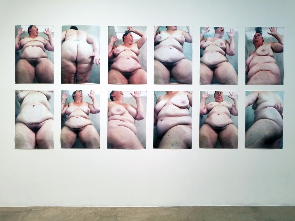
“The current project I am working on is tentatively titled perceive me. I am inviting artists to collaborate with me. Through personal observation and talking to many of my contemporaries, I have found that we often base our self-worth on how we think others perceive us,” she says.

Amanda Mears. Kristine Schomaker. Detail Drawing in process for Perceive Me1

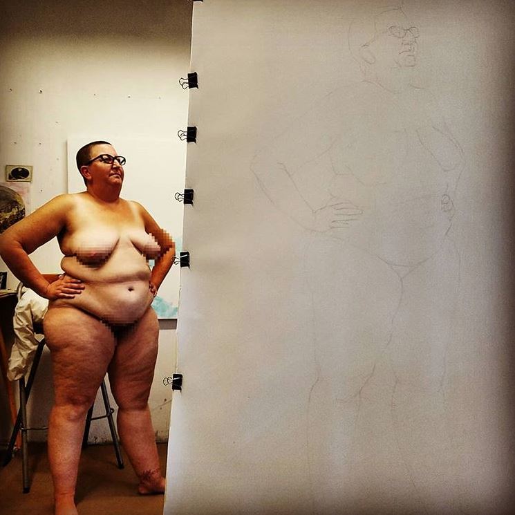
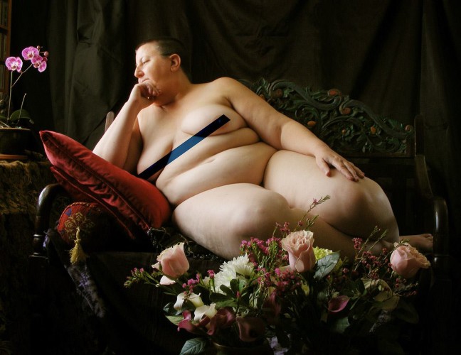
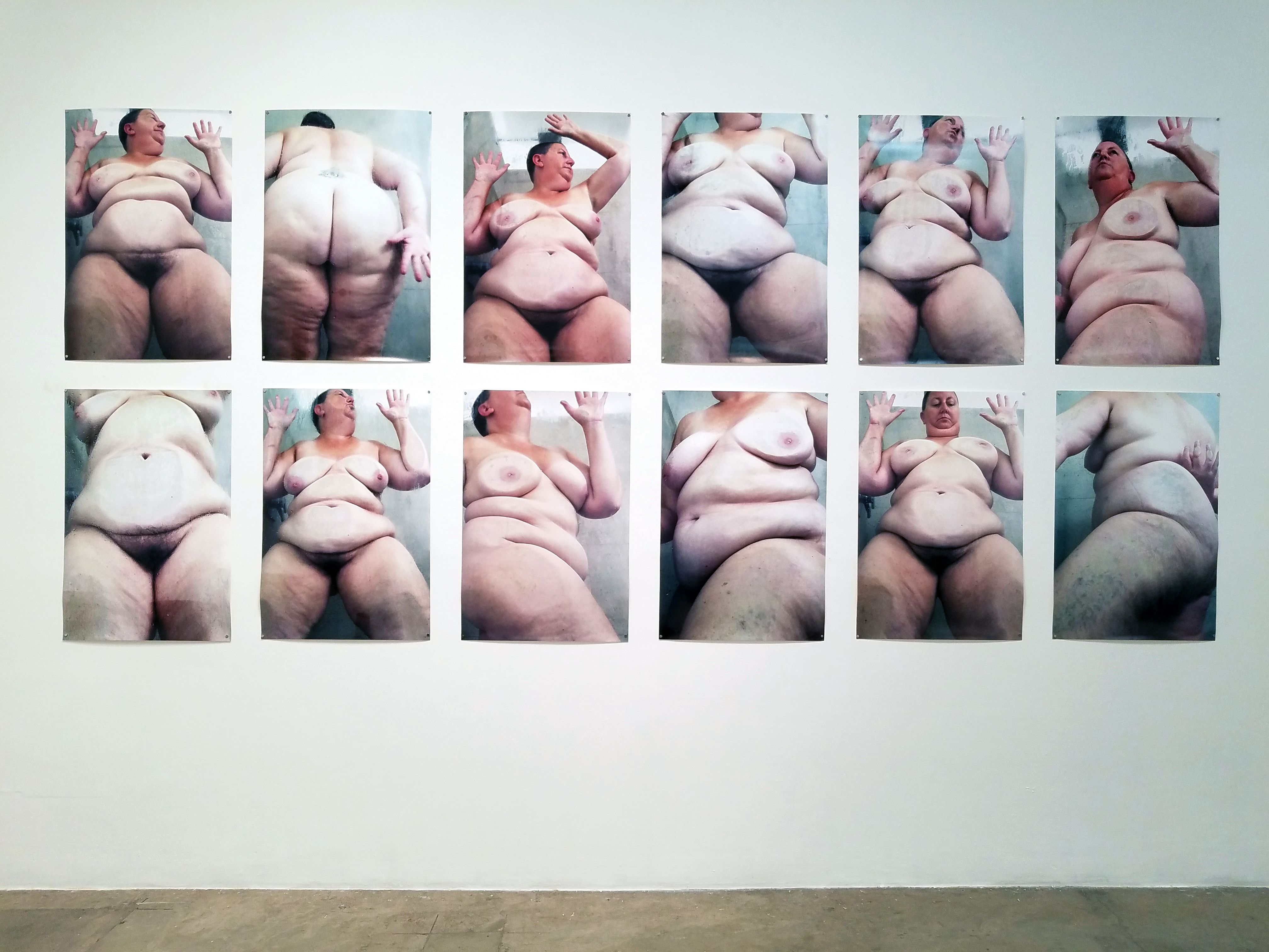
She’s invited other artists to paint/draw/photograph her to continue the conversation on validation and self-esteem. “I actually just realized the other day how truly personal, emotional and self-conscious this project really is. My own self esteem has been based on how I believe others see me. I don’t mean to sound melancholy and hopeless, because for the most part, I love my life and am pretty content being single and independent, but I can count on one hand how many times I have been asked out on a date. While I logically know dating is so complex, emotionally, I feel that it is because I am unattractive.”

She notes that through experience, research, and exploration, she is uncovering deep seated reasoning for many things that have taken place in her 45 years of life. “Isn’t that what artists do? Delve deep into our psyches to discover and deconstruct? This is an ongoing process to learn to love my body and myself. I have already worked with a few artists and the work is coming out so great. I am still trying to understand my own feelings about seeing myself through their eyes, but it is definitely a work in progress. I am currently sending proposals to various institutions for a show of the work.”

Martin Cox. Kristine Schomaker - work in process after Artemisia for Perceive Me

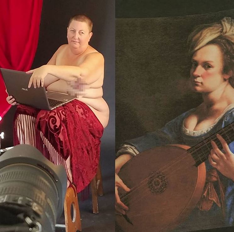
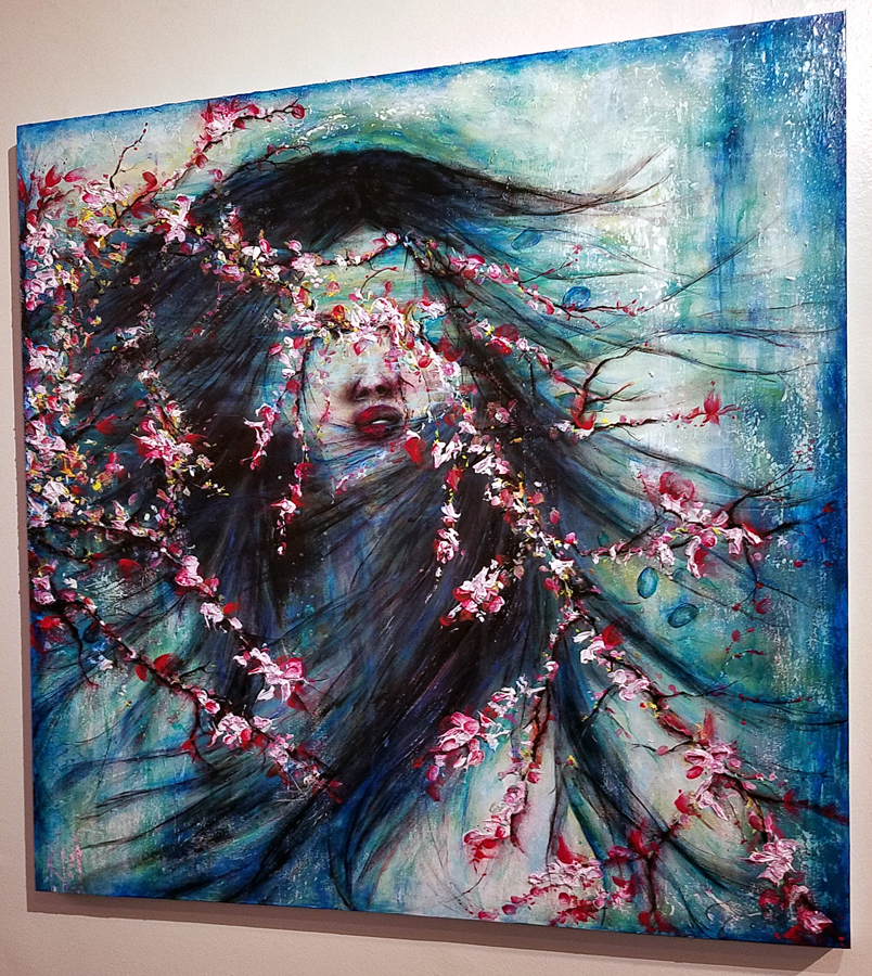
Having had the opportunity to see some of these works, they’re outstanding – but so, too, is Schomaker herself. She is forever open, literally and figuratively here exposing herself as both vulnerable and passionate, and opening the flood gates for so many women – and men – to really see themselves as well as seeing her. Both brave and beautiful may the words that comes quickest to mind when you look at Schomaker’s artistic oeuvre.

Yogurtland spoons

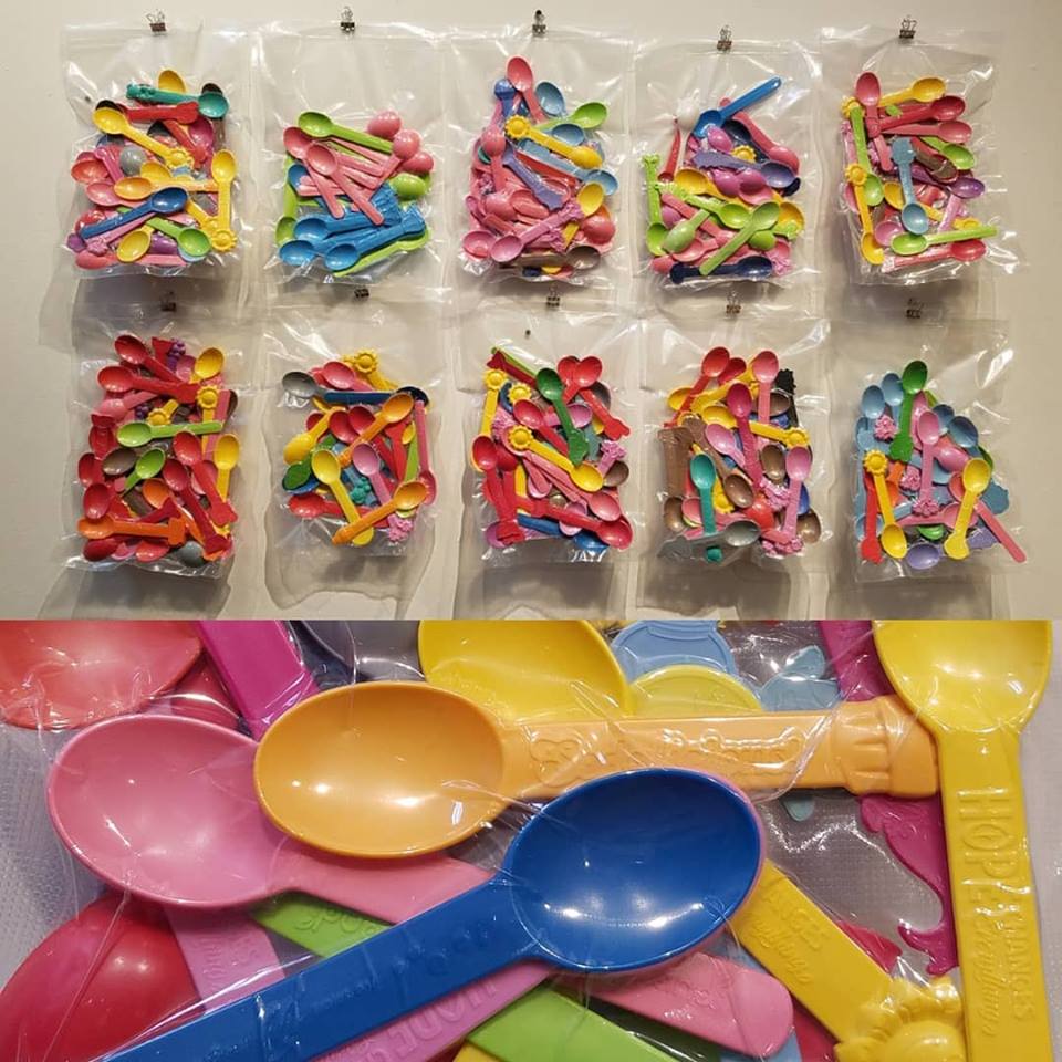
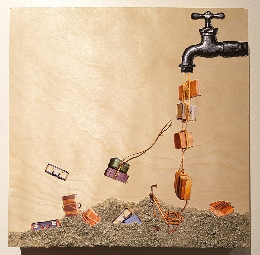
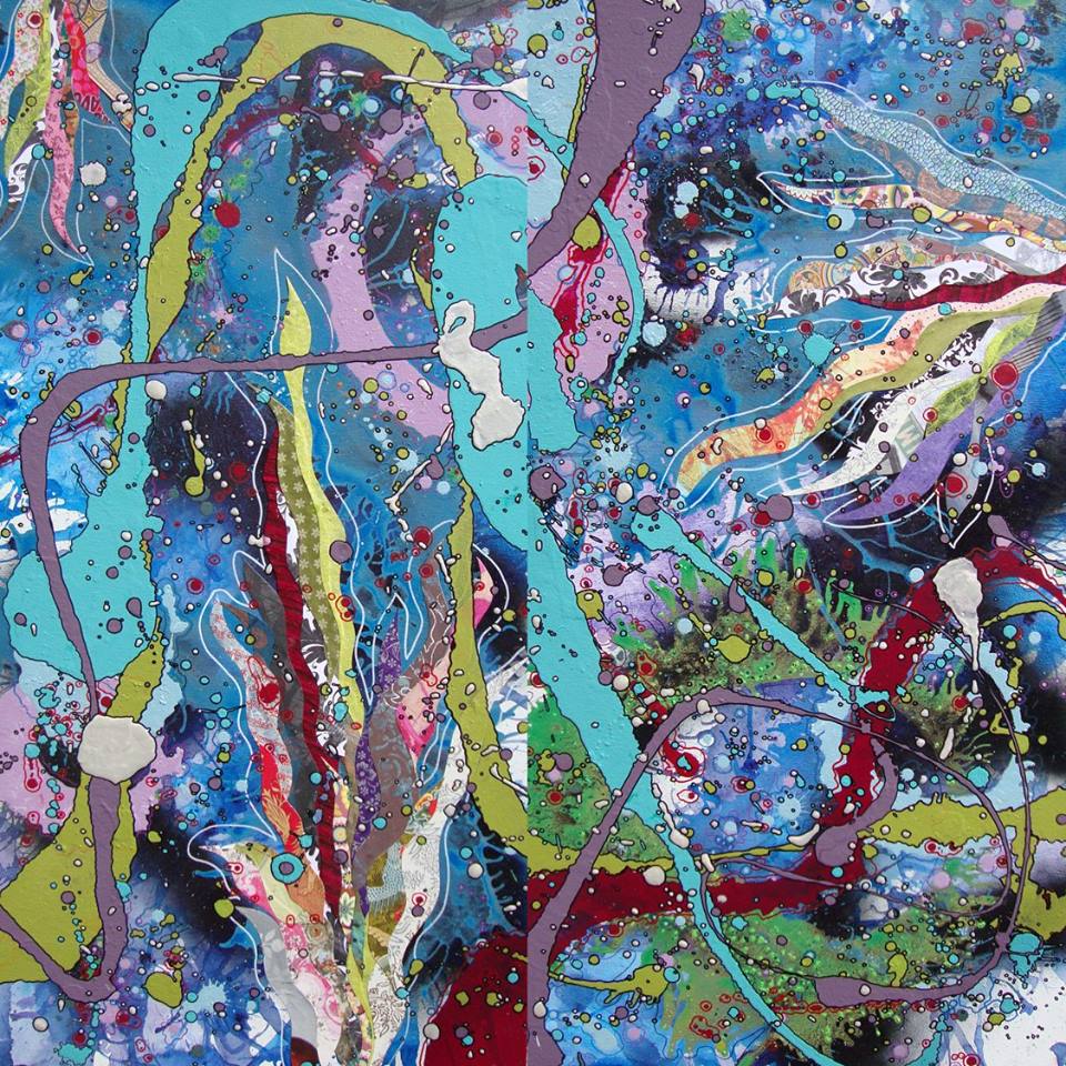
She also has a solo show planned at Fourth Element Gallery in Santa Ana in November 2019 which is going to focus on my installation work An Uncomfortable Skin. “I will be creating new work for that, too. Most of my work, one way or another, is a personal exploration of my eating disorder. The underlying causes through self-esteem, criticism, judgement, self-work and more. I either use my own body, or different ideas of food in my work. I am working on a piece using Yogurtland Spoons (my binge food) and vacuum sealed food bags for a show at Coastline Community College curated by Bradford J. Salomon in January.

She is also a powerhouse among independent artists as curator-muse, and PR pro. Her role in these aspects of the art scene continues to evolve.

“Since I started Shoebox PR 5 years ago, the art world has changed, and my ideas of the art world have changed. While I am the one educating my artists and introducing them to the art world, I am constantly learning, and shifting my perspective as far as questioning the artist’s role and place in the art world today. As an artist, I am on the front lines for working to figure these things out so I am able to offer valuable insight and perspective to the artists I work with.”

Shoebox PR artist meet-up

According to Schomaker, when Shoebox PR first started the focus was on promotion and marketing. As the company has grown and evolved, it’s become more of a support network for artists. “We offer resources and tools to help artists navigate their own paths. There is not just one straight and narrow road to get gallery representation. The idea that gallery representation is the holy grail of your art career is dissolving. Artists are learning to find their own opportunities with more alternative spaces, pop-up shows, artist-centric art fairs, and especially Instagram and Facebook. I don’t see this changing. There are some wonderful galleries out there who are showing edgy, important work, but they are limited. There are many more artists than there are galleries.”

To Schomaker,  artists “share the artworld. We are the gatekeepers. We need to be the entrepreneurs of our careers. I completely understand that a lot of artists don’t know where to start. I was lucky enough to have an administrative background as well as creative, so I am able to offer to help artists figure all of this out.”

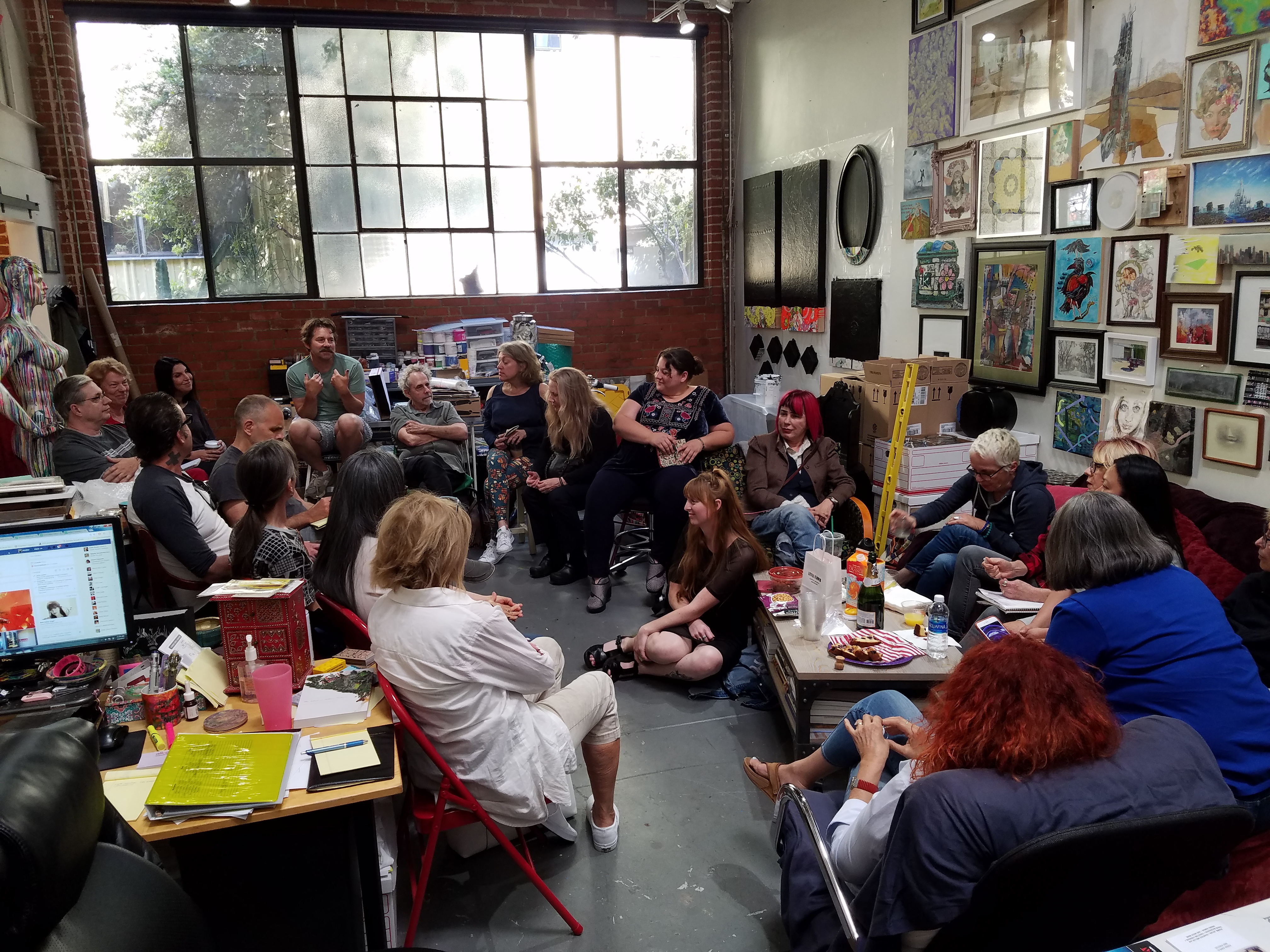
Never content to rest on her laurels, Schomaker is starting a non-profit, January Arts, which is a community based organization creating/facilitating opportunities for partnership and collaboration among artists, influencers, institutions and the public. “We have already started doing residencies at our Shoebox Projects space along with free art critiques and portfolio reviews. We are looking to expand and support those underrepresented artists who need help,” she relates.

Asked what inspires her to create, today she says she isn’t sure and has felt stuck, and has not painted in awhile.

44396277_1879619828774583_1358849449689874432_n

“There is so much going on in our society: politics, the fires, mass shootings… that I have found it hard to concentrate on making art. I know with so many artists, they use these events as catalysts for creating, and are fired up and ready to get in the studio. But often, I just stare blankly at my work table and can’t move. I am not the type of artist to go to the studio and work 8-10-12 hours a day. My work normally comes more intuitively and spontaneously. I come up with ideas in the car driving, or in the shower and then immediately have to create.”

Indeed, for Schomaker, taking that relaxing hot bath may be the very best way to trigger her creativity into overdrive.

Plus at Claremont Graduate Univesity Art Gallery

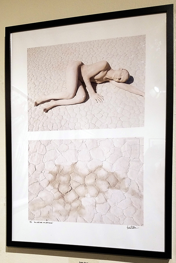
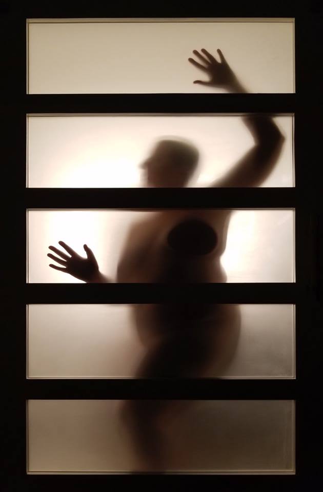
“One of my recent bodies of work, my Plus series happened spontaneously in a hotel room when I saw the frosted glass bathroom door. All I had was my cell phone, so I played with my nude body, the door and the dark room. It was a great series that gave me a solo show.”

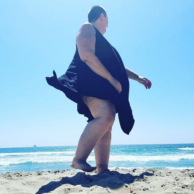
She adds “The exploration of myself, my eating disorder and self-worth also inspire me to create. While I have a journal and often write, I feel I can say more through art. It’s funny, as I talk about this, I realize that the politics of the body are definitely inspiration for my work. Sharing my curvy, plus-size body on Instagram has become a rebellious act against the status quo, against our selfie culture, against photoshop and advertising. Saying this is who I am, the real me, is a way of saying F you to the beauty industry for years of manipulation in shaping our attitudes and our lives for that matter.”

Schomaker feels her work has evolved in the past few years, changing with the times. Although she feels she is still dealing with issues of identity, she is in a holding pattern with her painting at the moment.

“I have realized it is hard separating my work life from my art life. While I believe it is all one life, they are separate in that my art life is more personal, about me. Of course, because of that, I think I am also afraid to jump in, because I get closer to who I really am and maybe I am afraid of finding out. For now, I will continue to create work as it happens. I am working on doing more social media art. Sharing myself on Instagram more to tell my story there. I feel the audience is broader and I can get my message out to a much larger audience there.”

She is also forging a path that is opening doors not just for recognition of her own work, but as a way to lead others in the Shoebox PR family onward.

45323500_10155843479178587_4293311856690331648_n

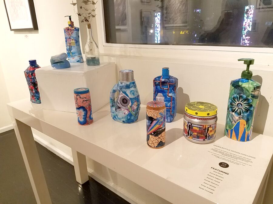
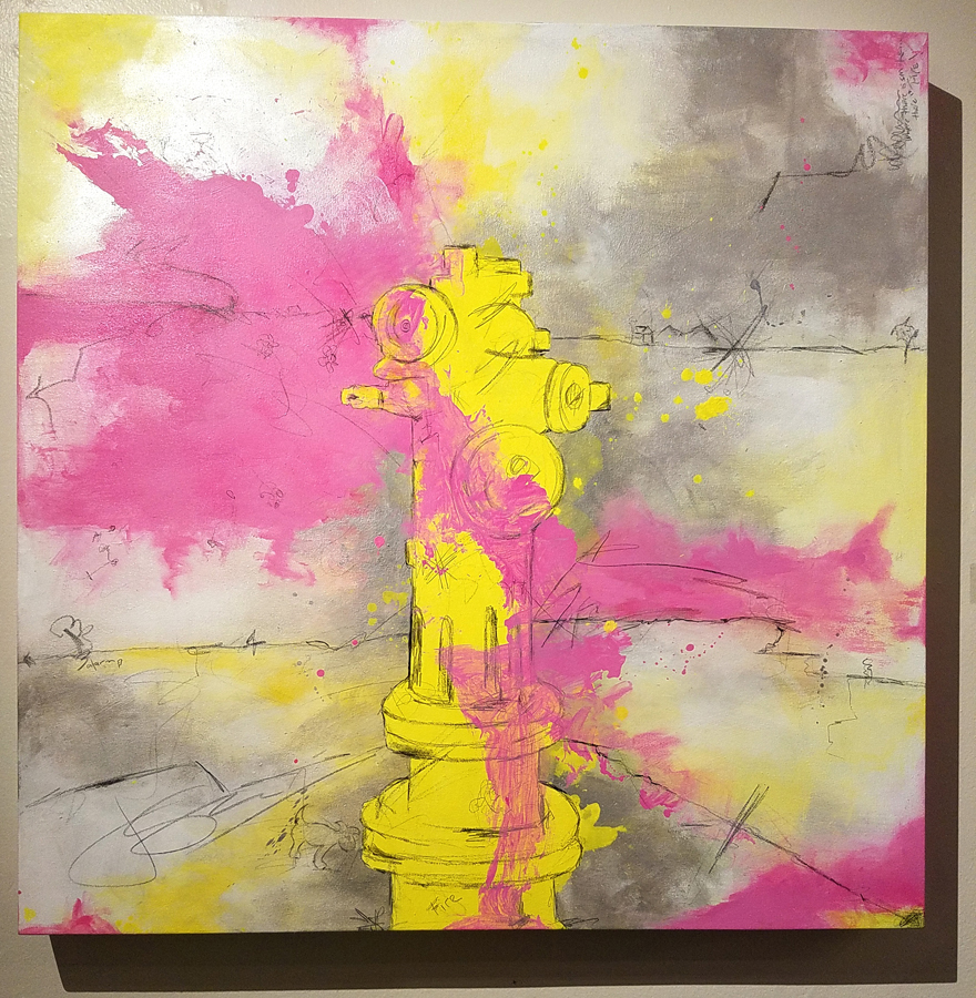
As an artist, she works in a variety of media. “Everything I come into contact with may be a tool for my art. My cell phone has been my trusted companion in a lot of my work. As an artist, I just use what is available. I am really loving using things that weren’t traditionally made for art, such as the Yogurtland spoons, a kitchen vacuum sealer or a paper shredder, but then I love getting back to my Nova Color paint and manipulating the flow and pours. I love when both of these different things collide.”

27867435_1416309925164032_8085313220005375212_n

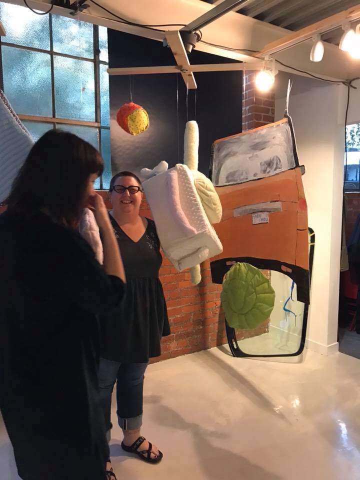
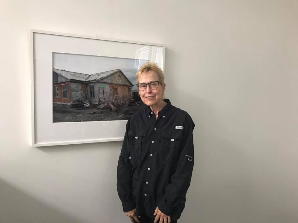
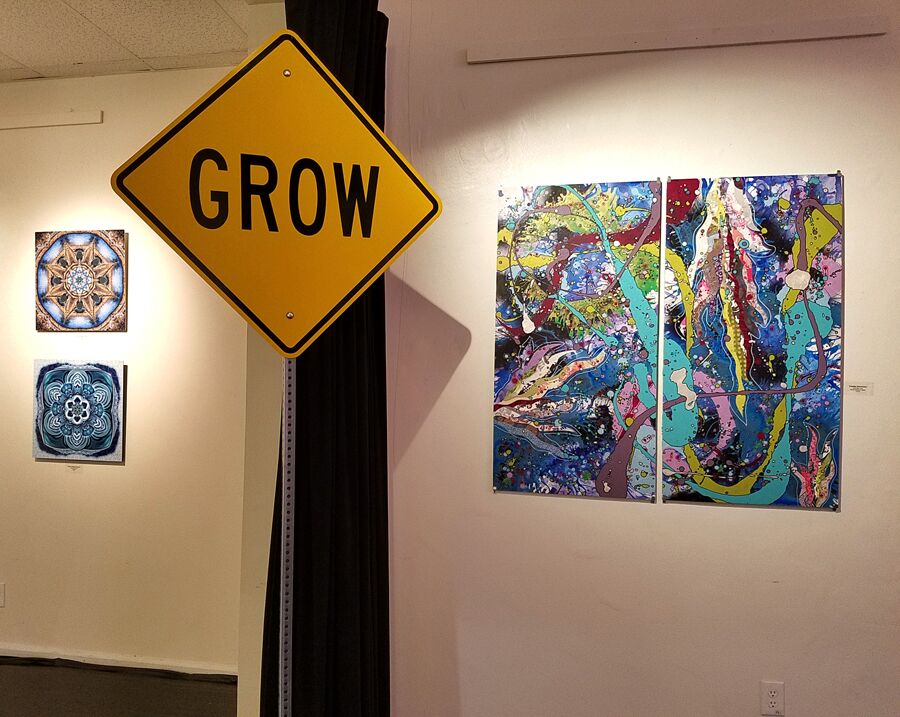
Above, Schomaker at Shoebox Projects opening exhibition for artist Dani Dodge

As a curator and galleriest she says she looks for strong narratives and storytelling, authenticity, passion, good craftsmanship and a conversation between the art. “I am not into artist statements that are all artspeak. I want to see the personal, the story, the why.”

As far as representing artists, she asserts “I know how hard it is living life as an artist. We can be sensitive, emotional, angry, lost, unorganized, desperate, alone, tired, sad… the list goes on. I have been so lucky to have worked with some amazing mentors who made me feel that I wasn’t alone, that there is a whole community of like-minded people who are in the same boat as me. I seem to be a natural facilitator/leader/teacher, and I find it fulfilling to be able to share my experience, expertise, and knowledge with others and help them feel not so alone when juggling the life of an artist against everything else going on. I feel that this is my way of giving back for so much love and support I have received.”

It doesn’t get much better than that.

  • Genie Davis; photos provided by the artist

Bridget Riley at Spruth Magers Gallery: Painting Now

riley window

The following is an exciting, in-depth guest post from artist Heather Lowe

“Look at it. Just look at it!”, Bridget Riley exclaims as the light “grew brighter and stronger every minute.” This comes from an introduction to a catalogue of Bridget Riley’s paintings that traveled to the Albers Museum, written by Robert Kudielka. Kudielka, one writer among many great writers who enjoy writing about Riley’s paintings, describes Riley’s intimate and lasting relationship with nature.  Bridget Riley grew up in Cornwall where the sea sparkles and the soft lichen and grass cover the hillsides. At eighteen, she entered Goldsmith’s College School of Art. From 1952-1955 she attended the Royal College of Art in London. In the summer of 1960 she traveled to Italy with Maurice de Sausmarez. At this time, she began her color field studies and we are privileged to see one here in Los Angeles: “Pink Landscape” which was influenced primarily by Seurat. Here we see dots and dashes of color interaction soon to evolve into Riley’s “units” of composition. Riley had already meticulously copied Seurat’s work. She was also moved by the futurists in Italy, including Balla and Boccioni.  Fleeting movement and the element of surprise are also evident in her work.

The exhibit Painting Now at Sprüth Magers is thoughtfully curated and brings Bridget Riley’s paintings to Los Angeles for the first time since the 1970s. The gallery’s press release states that the title comes from a lecture Riley gave at Slade School of Fine Art in 1996. Oh, there have been a few Bridget Riley’s here and there. Cirrus always had a few, MOCA exhibited a painting a while ago (Green and Magenta Diagonal, 1968) and Santa Barbara had one of her black and white artworks from 1960’s last I checked. But we have not seen Riley in L.A. like this ever before. LACMA recognized the importance of this event and held a panel discussion wonderfully moderated by Lynne Cooke. The brilliant Michael Bracewell generously shared his knowledge of Riley’s practice and purpose. Toward the end he mentioned Riley’s element of “joy” and let us know she is currently looking at Constable: his clouds. Her painter assistants were in attendance.

This show has 23 artworks from the 1960s and then hurtles into 2014-2018, with the exception of “Vapour 2.” The show elucidates strong parallels in Riley’s work. As you enter, to the right you see her masterpiece, “Late Morning 1,” 1967. Riley does series of works, as you will find, in all her investigations. This painting is composed of vertical stripes, alternating and varying reds and blues, which compress and relax the white areas so that a kind of morning light emanates from the center through color interaction and after-image. The painting breathes.

heather 1


Also, in this room are three of her “Memories of Horizons.” The stripes are horizontal, painted in primarily warm, hot colors and some cools but overall warm/ hot sensations and they appear to undulate upward and downward. It’s wonderful to have three of these together to compare color movement and rhythm. Memories of Horizons is from a poem by Mallarmé, says Riley, “in which a long stream of consciousness tries to answer the question: what is the world?” These paintings are horizontal and so “Horizontal Vibration,” done in 1961, is placed on the opposite wall and is reflected in the “Memories.” In this very early work, Riley was first discovering how black and white could be modulated, shifted, and displaced to release energy from the painting surface. It recalls the afterglow of a sea surface or desert plain.

heather 3

Moving into the next room we get the full reward of her years of intense painting in black and white. The surprise for me was “Quiver 3,” 2014, graphite and acrylic on the wall, about 150 inches in length (above).  In this and “Divertimento,” 2016, acrylic on canvas, reminiscent of her beautiful early painting, “Tremor,” 1962, Riley paints what appear to be very simple units of triangles on a triangular grid but with slight dips and curves carved or added to the sides. In her drawings during this period, one can see the myriad ways she labors to shift the pacing between the units by turning and varying the individual shapes. Levels rise and fall, movement sparkles throughout the surface activating our senses. It’s important to her that the units do not stand out on their own but complete a harmonious unity.

heather2

“Descending,” 1965, 36” x 36” (above) absolutely cracks and warps the surface and has many other wonderful color sensations. It was her early black and white painting that shot her name to fame rather violently, as some of you may know, when at the Responsive Eye Exhibition in New York, someone copied her painting “Current” on fabric and put it in a window display.


Later, in an interview with Andrew-Graham-Dixon, Riley describes the opening: “It was astonishing, about half the people there were wearing clothes based on my paintings and I tried to avoid having to talk to the people who were the most completely covered in me. There was one member of the MOMA council who was so furious that he said, ‘So you don’t like it? We’ll have you on the back of every matchbox in Japan!’…” She goes on to say that being in America was wonderful and the artists gave her much support, but it was tough for her to be taken seriously during this time. Since then, of course, she has received many accolades including the first woman to receive the Venice Biennale Major Painting Prize in 1968. Riley has also influenced so many painters through the decades. She and other Op painters working with perception and optical sequences changed the activity of picture plane. It was truly a new way to treat the planer surface. The paintings are visceral in this room so take them in slowly or at a glance.  I believe gallery lights are a tad too bright for artwork in this room and are unnecessary. They are splendid on their own!

Upstairs we are greeted with some of her most recent work: “Measure for Measure.” We have number 23, 24 and 25, square 62-inch compositions and their accompanying smaller studies 25-inch squares. (Yes, there are numbers 1-22 somewhere). She painted a lot of these disc paintings. Also, in this room are two wall paintings with the disc units titled “Cosmos 2,” 2017 and “Untitled 2,” 2017-18. Her Measure for Measure painting series has been exhibited as early as 2016. Using lavender, green and orange at a very light saturation and mid-value, circles are painted in a grid in different compressions, sometimes tight, sometimes loose, sometimes discs go missing and the color sequences vary as well. They are calm and quite a contrast from the black and white paintings. The key to these it seems is what happens to the white areas which the colors live in: color irradiation. The white areas surrounding the discs have color after-effects, to be sure. There is also a kind of inner light that the discs seem to throw upon one another due to color contrast and interaction. I found these soothing but unpredictable. The “Untitled 2” is more minimal and daring. Very beautiful vector after-images set up and the open field is there. Riley has made use of discs in her early work when she started to introduce greys into her paintings. Riley has stated in several interviews that she is not concerned with the shape as signifying something.  Also, she is interested in color-form, not colored forms. Two treasures from this early work are in the show: “Black to White Discs,” 70” square and “Study for Black to White Discs,” 35” square. In these paintings one can see Riley’s exquisite workmanship. The orientation of the composition is diamond shaped and the graduated tonal sequence of the discs move slowly across picture plane. I had to convince a gentleman that, yes, indeed they are painted. They are not prints.

Bridget-Riley-Pink-Landscape

And we come full circle to her “Pink Landscape” painted in 1960 beside a really lovely “Vapour 2,” a striped painting done in 2009 which, coincidentally, has the same color combination as the disc paintings. Alas, we do not have any paintings from the late 80s and 90s: her Egyptian palette. I love those. But it’s an excellent show. Bridget Riley works toward nature. She paints intuitively. Her compositions have developed through her experienced and responsive eye. In her own words: “As a child one plays by lying on one’s back and filling one’s sight with the blue of the sky only to find the blue goes slowly towards grey. Your own eye produced the after-image of yellow-orange to compensate for the intensity of the blue. Color relationships in painting depend on the interactive character of colour; this is its essential nature.”

Go see it! Learn something.

The exhibition will be up Nov. 16, 2018 – Jan 26, 2019

Bridget Riley: Flashback, Hayward Publishing, 2009

Bridget Riley, Paintings 1982-1992, Introduction by Robert Kudielka, Printed in Germany, 1992

Bridget Riley by Maurice de Sausmarez, Studio Vista Limited, Great Britain, 1970

Bridget Riley, Dialogues on Art, Philip Wilson Publishers, London, 1995

Bridget Riley, Financial Times, Nov. 8, 2018

  •    Feature by Heather Lowe, Photos:  Jennifer Faist Hill

Shades of Water is Liquid Beauty at the Montalban


QgWp1EwA

At the Montalban Mezz Gallery through January 31st, Shades of Water, curated by Baha H. Danesh is both liquid lovliness and a highly prescient exhibition that underscores the urgency of modern environmental challenges from climate change to pollution of our oceans.

The exhibition, presented by We Choose Art, includes paintings, sculpture, photography, fiber work, and installation art.

20181116_202514

20181116_202430

The group show documents images of water and its importance, expanding upon and encouraging conversation on both climate change and sustainable energy. Featured artists include Amabelle Aguiluz, Barbara A. Thomason, CanLove, Chenhung Chen, Daggi Wallace, Eric Minh Swenson, Felís Stella, Joan Scheibel, Joelle Cooperrider, Karen Hochman Brown, Kellie Walker, Kristine Schomaker, Margaret Hyde, Rebecca Laws, Scott Froschauer, Susan Poms Amorde, and Winston M. Secrest.

pP8Rhq0Q

Featured works include Joan Scheibel’s contemporary abstracts, the contemporary realism of pastel artist Daggi Wallace, and the delightful sculptural work of Scott Froschauer. Chenhung Chen’s found and mixed media sculptures and wall art are a delicate yet visceral standout. Her copper wire work is as delicate and ephemeral as waves in the wind.

IdUj62CA

Working in video and photography, Eric Minh Swenson’s art seeks to immerse viewers in powerful images.  Kristine Schomaker displays lush abstract painting that takes on the shapes and sinuous quality of water droplets and mysterious pools.

nLb0GnhQ

Mixed media work from Susan Poms Amorde and the swirling kaleidoscopic patterns of Karen Hochman Brown add fresh dimensions to the topic.

20181116_200029

Also on display are the clever and cool eco-friendly art by the students of Birmingham Community Charter High School in Van Nuys, displaying their entries in the Green Bottle Design Challenge.

RaRUFI2Q

The collaborative community of We Choose Art has once again offered a vibrant exhibition infused with the spirit of activism. Come thirsty for art, and drink deep.

pNkfgFRQ

20181116_205835

20181116_202456

20181116_202521

20181116_202338

20181116_200004

  • Genie Davis; Photos: Kristine Schomaker