Mis (Missing) Information: Jody Zellen and Brian Moss Curate the Media

20180427_1L6A6791-Edit
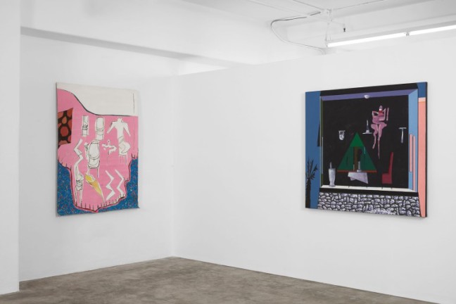
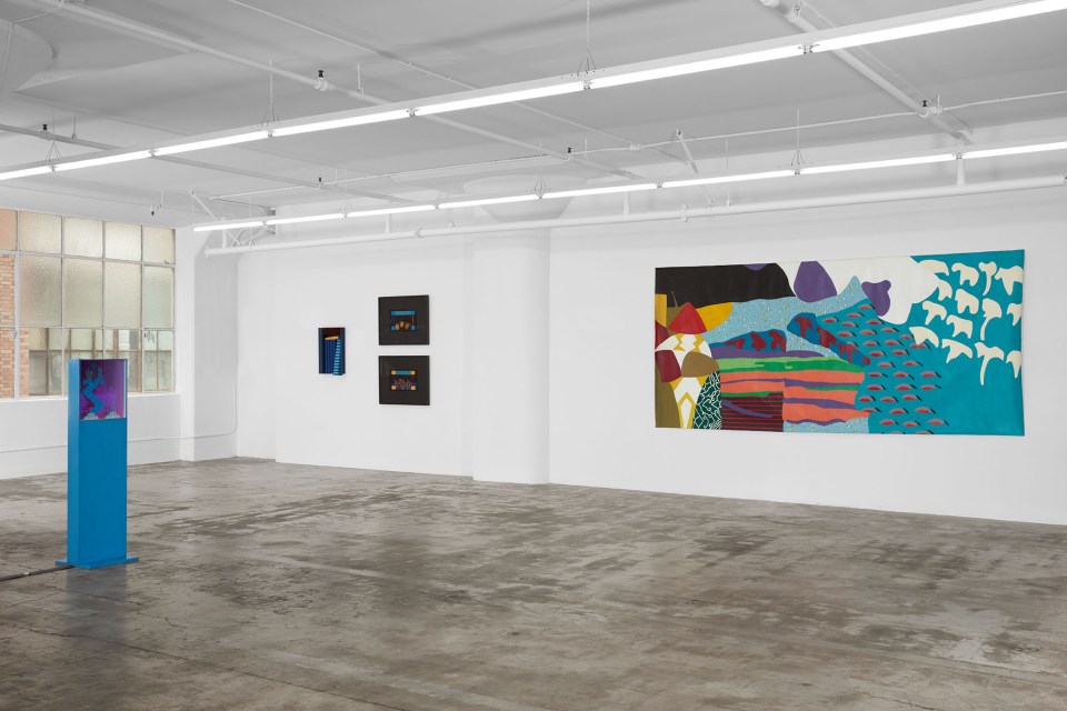
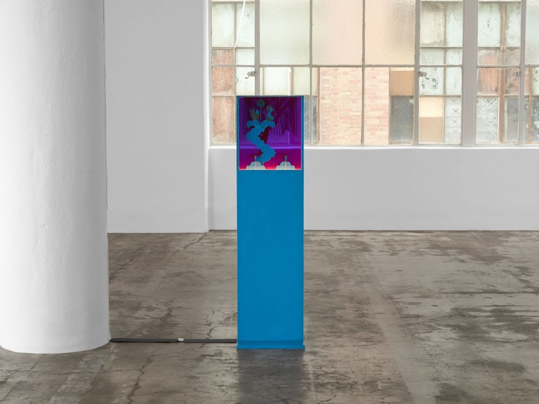
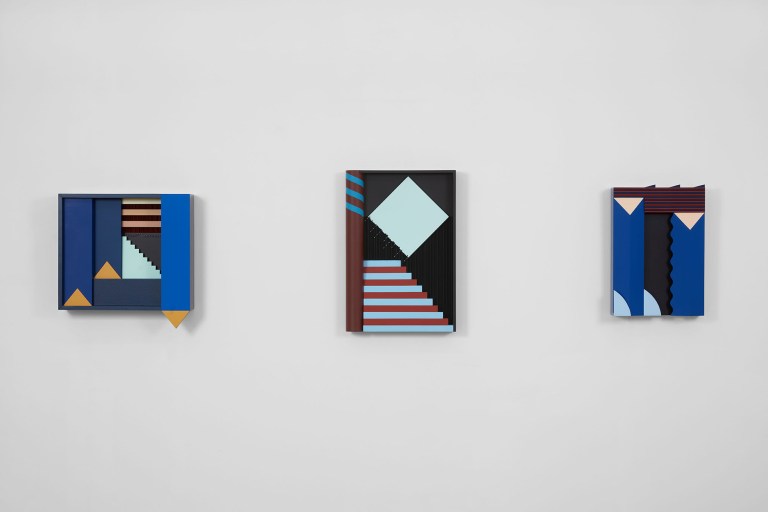
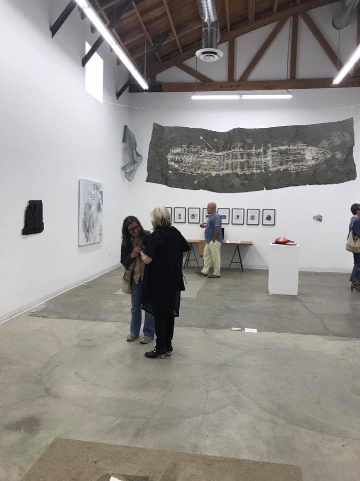
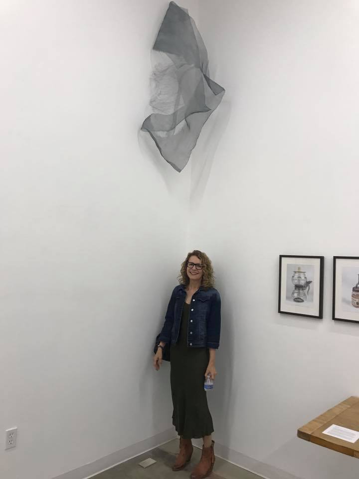
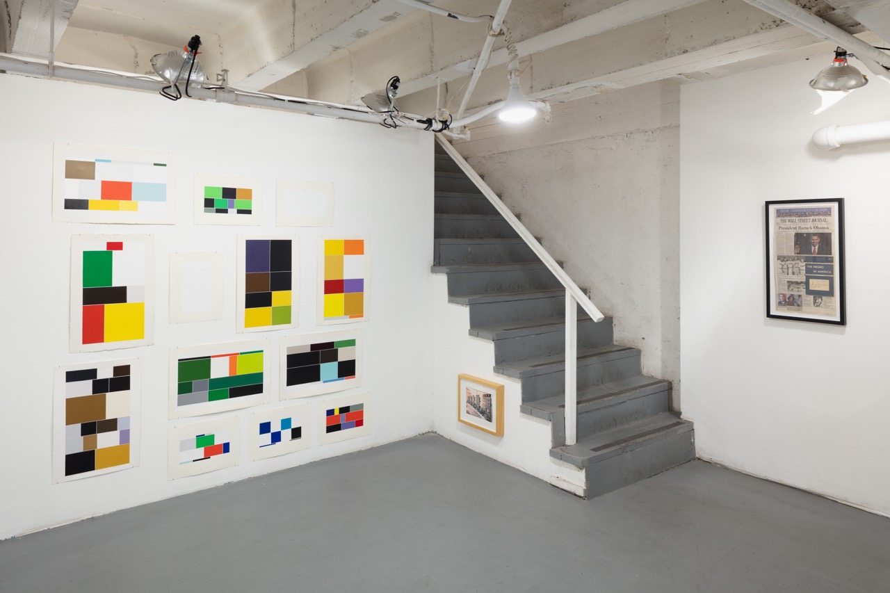
If you missed MIS (MISSING) INFORMATION, the powerful show at Charlie James that closed at the start of this month, make no mistake, you’ll be seeing work both by curators Jody Zellen and Brian C. Moss, and the artists in the exhibition again, soon.
zellen
The exhibition featured works which drew from ‘the media’ in one way or another.  Beginning with an image, a Google search, or the daily newspaper, the artists in this exhibition shift the information dialog in fascinating, evocative, and prescient ways.
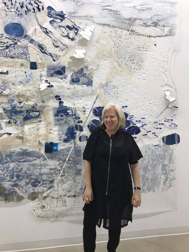
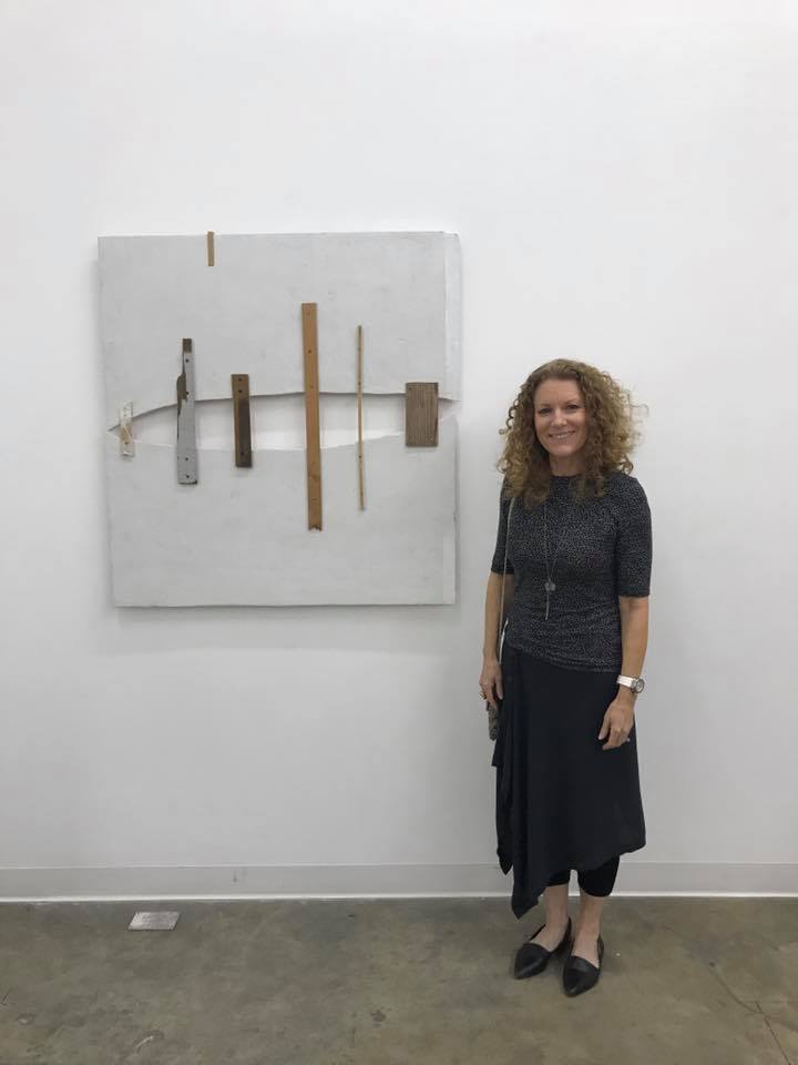
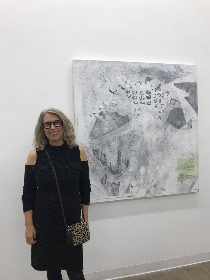
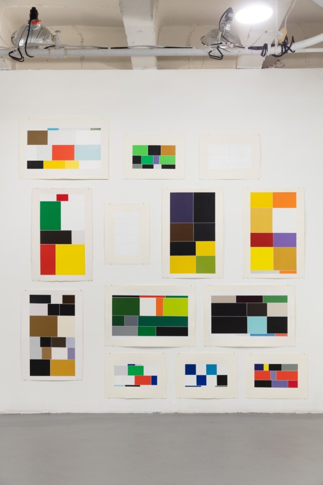
The thirteen artists include:  Merwin Belin, Jan Blair, Andrea Bowers, York Chang, Michael Genovese, Elissa Levy, Brian C. Moss, Michael Queenland, Casey Reas, Susan Silton, Samira Yamin, Andrew Witkin, and Jody Zellen.
Print and digital mediums were both a part of the show. Zellen notes that print was a particularly fertile ground for art making.
20180427_1L6A6797
“As raw material for art, this combination of paper and ink amounts to a never-ending supply. It’s relatively cheap and endlessly varied. Most of the artists in this exhibition have a predisposition to print, as only a few have embraced digital delivery of information. The ways artists have and continue to use news media as form and content in their work is wide-ranging.”
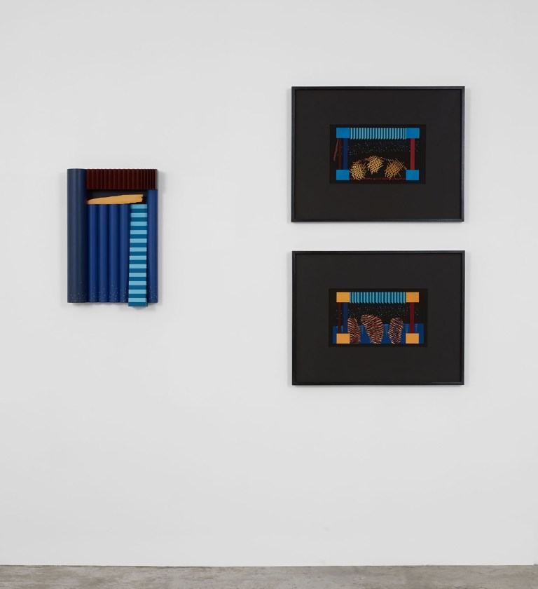
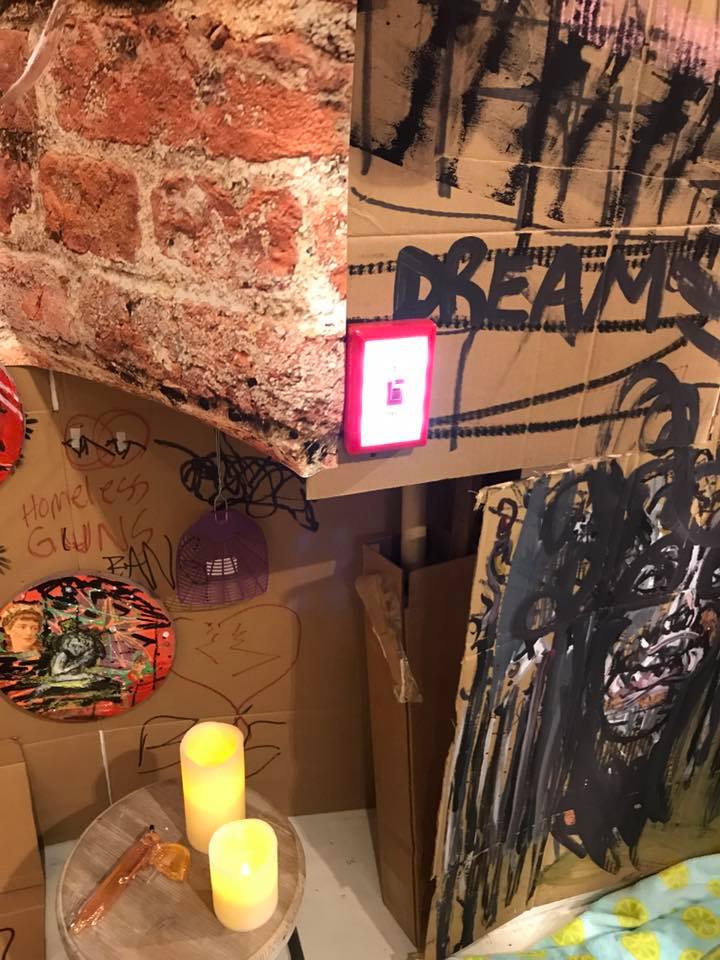
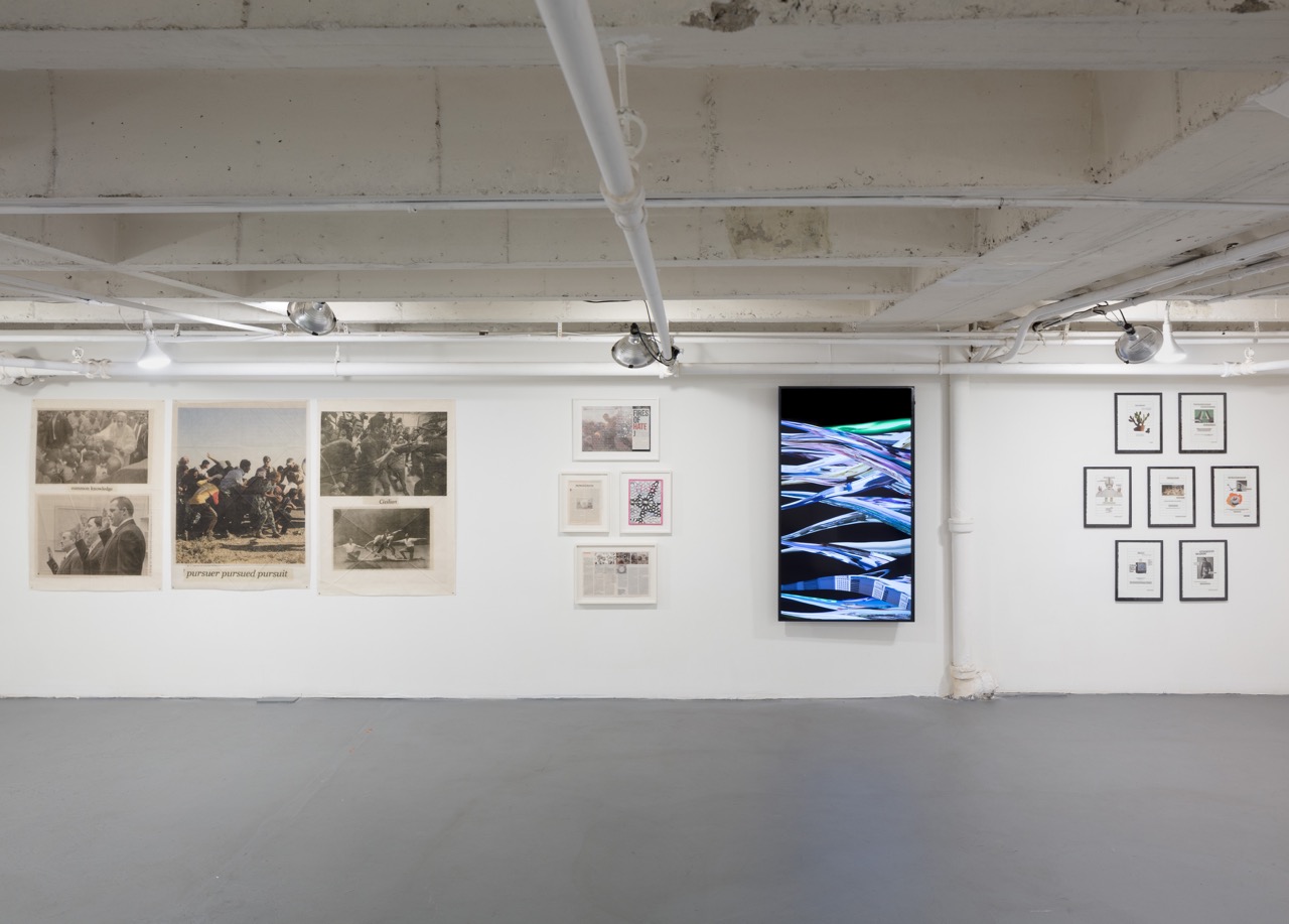
From the altered newspaper pages of Merwin Belin and Elissa Levy to the work in which artists such as Jan Blair, York Chang, Michael Queenland and Andrew Witkin clip images and texts, representing them in new configurations, there are new front pages, shamed icons of power, and a reflection of both glory and self-loathing that seems to define modern information culture.
chang
levy
Blair looking for clues and hidden information about our civilization the pages of The New York Times.  Chang works from an archive of found images and text culled from years of scanning the Los Angeles and New York daily newspapers.  Queenland presents a pairing of the front and the back of a single newspaper clipping, while Witkin selects multiple newspaper clippings because they contain printing errors, shaping images from these which are then shrink-wrapped and encased in a custom frame.

20180427_1L6A6789

In contrast to his selection of errors and information overload,  Susan Silton and Samira Yamin are interested in transformation.
“Through her familiarity with the international language of commercial offset printing, Silton has commissioned printers in different countries to create a series of posters that call attention to the relationship between different types of appropriated materials.  Yamin creates intricate geometric patterns found in Islamic culture by hand cutting information away from a January 11, 2010 edition of Time magazine dedicated to the ongoing wars in the Middle East,” Zellen says.
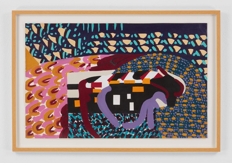
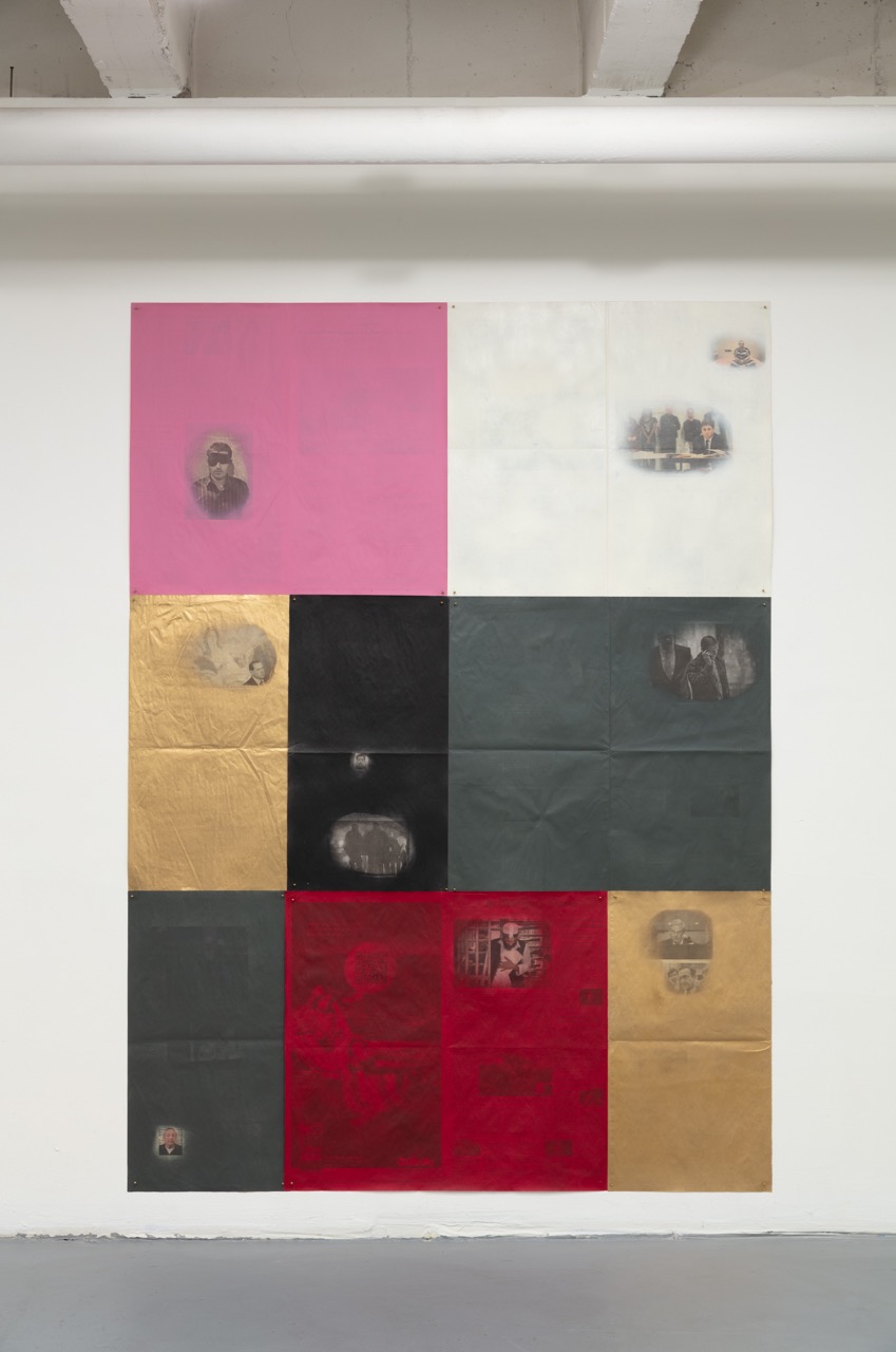
Andrea Bowers and Brian Moss also step back from the mechanical, using graphite to transcribe what they find on the printed page. Moss creates jarring juxtapositions in the form of delicate tracings; Bowers creates using highly detailed pencil drawings of activists in the service of social justice.
reas
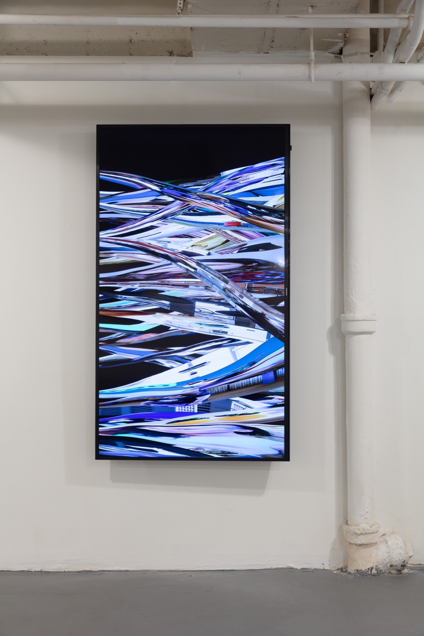
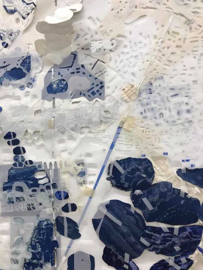
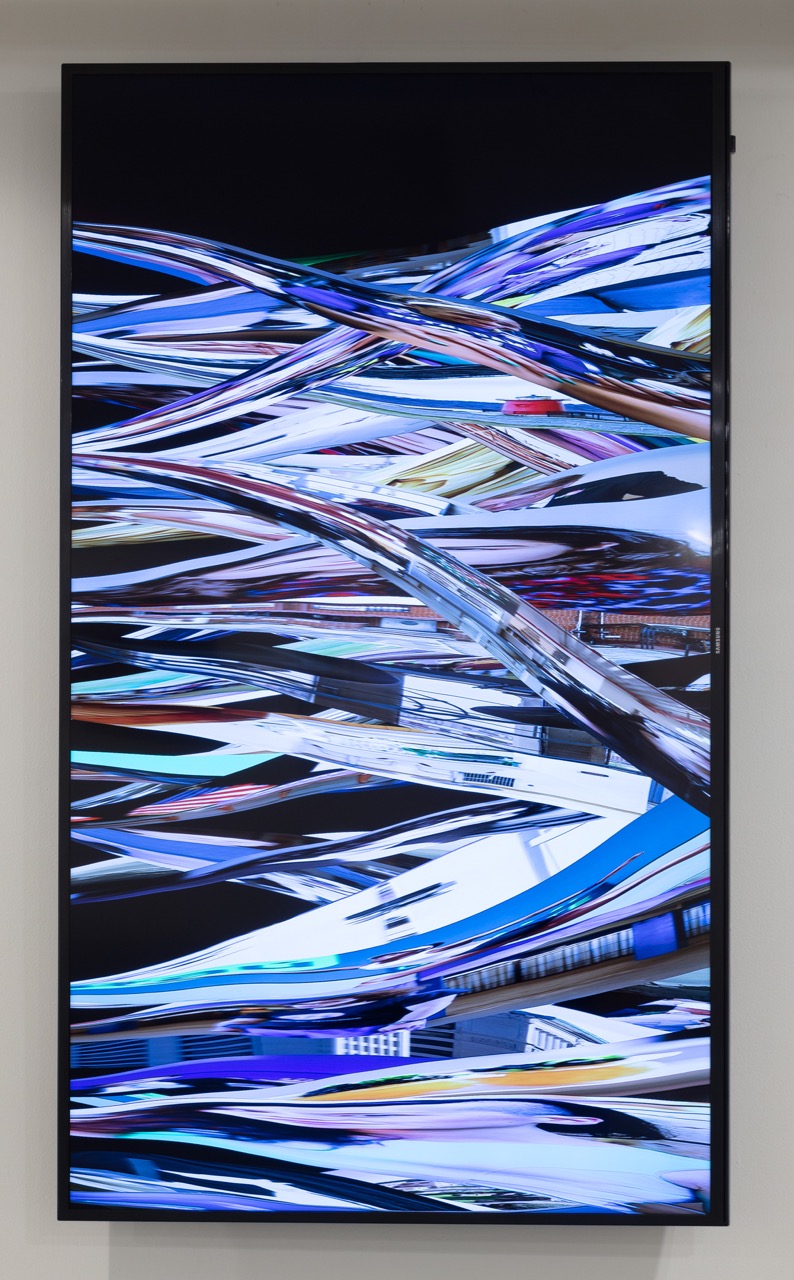
Casey Reas and Jody Zellen both gather their content via digital algorithms, while Michael Genovese uses the computer as a starting point, typing specific searches into Google and capturing the results before the images appear.
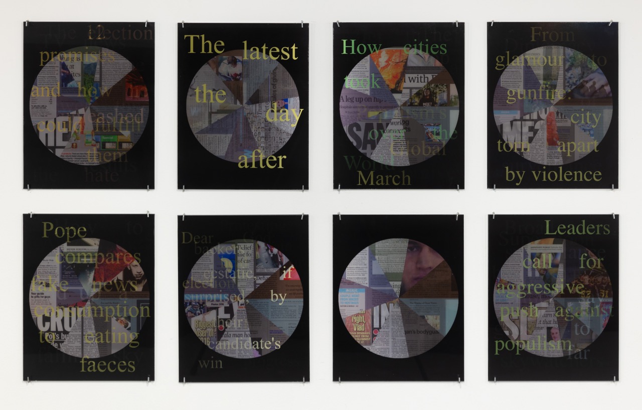
In Zellen’s own piece, News Cycle, she collages front pages and headlines originally captured by her iOS app, News Wheel.
20180427_1L6A6795
“Each artist in the exhibition mines the media looking for specific content,” Zellen says. “Their artworks call attention to what is seen, what is missing and what is inferred, as well as the myriad reasons for the disconnects between fact and fiction and the wonderful dissonances that are discerned through their creative investigations.”
According to Zellen “This was not not solely a newspaper art show, but one about missing or mis-information, taking into consideration what is presented, missing and how we fill in the blanks about this kind of ‘information.’
Zellen says she couldn’t play favorites with this exhibition, which focused on LA-based artists, but also included those from out of the region.
“I like them all for different reasons. I was blown away when I saw Merwin Belin’s show at as-is gallery and knew I wanted to include his work in this context. I love York Chang’s new pieces. I saw Andrew Witkin’s work in an art fair 2 years ago and the stayed with me and I knew I wanted him to be in the show. I was also quite taken with Michael Genovese’s images of the screen before information loads and thought they would be an interesting counterpoint to images of the newspaper.”
reas-detail
Zellen says she wanted to include both artists who work with the actual newspaper and artists who “appropriated” the concept.
“For example, Casey Reas uses the digital version of the NY Times to create an ever changing stream of folding news images in his computer generated work. In thinking about the space, I wanted to draw people to the center of each wall where there was a colorful work, then out to the edges. It was also really important to me to include more than one work by each artist if possible, so it was not a show of one image by each artist. I wanted to present bodies of work, not single images.”
Offering an exhibition that was absorbing, deeply pertinent, and, yes – newsworthy – Zellen and Moss created an exhibition both for and about our times. It was one of our favorite topical exhibitions of the year so far, with plenty to “read into” contained within the images.
Look for these curators and artists to pack more of a political and social punch soon.
– Genie Davis; photos: provided by curator

Pro Proscenia: An Elegant Exhibition Closing this Weekend at JOAN

PerProsceniaInstall5

It’s time to hurry: Pro Proscenia is closing this weekend at Joan Gallery. Curated by Jeanne Dreskin, the three solo artists  – Walter Askin, Sandra Vista, and Elizabeth Bain – each convey a beautiful and unique sensibility.

The works on display are retrospective in nature,  spanning the time period from the 1970s to the early 90s. Highly detailed and vibrant in palette, the works each manipulate space and surface, crossing the line between painting, sculpture, collage, and drawing. The dimensionality of each work engages viewers,  and represents beautifully rendered techniques that call into question both time and space.

PerProsceniaWalterAskinSculpture

Askin in particular looks at time – as a line to be followed in a hopscotch fashion. Working with cultural images taken from a random series of historical times, he combines artifacts and figures, shaping worlds that shift beyond the natural realm into that of the highly theatrical.  They glow and shift, a lovely transitional element in inherent in his body of work.

PerProsceniaElizabethBain2

Bain looks at a world of night landscapes and urban geometry, creating evocative abstract images that revel in a world that is staged – or perhaps as Shakespeare put it succinctly, all the world IS a stage to her. She shifts horizons into stage curtains, cityscape into facade. We are an audience not the performers in her precise landscape.

PerProsceniaElizabethBain

She uses shapes as metaphors for more detailed images, and her palette is that of a city after dark, her images as a kind of wordless signage.

PerProsceniaSandraVista

Vista’s work uses a wonderfully rich, highly feminist series of techniques and images, touching on the Pattern and Decoration movement that originated in the 70s and 80s while reimagining the ideals and images behind it with layered, tactile works that feel rich and deep.

PerProsceniaInstallSandraVista2

Her images resemble quilts and tapestries, dancing with color and texture.

In the work of all three artists, we get a sense of artistry and artifice, of subtle meaning and refined motion.

PerProsceniaWalterAskin

We see stylized figures,  familiar yet reimagined shapes, and layered, fabric-like patterns. It is in these ways that the artists – and the viewer through them – makes sense of the world, or rather, changes the sensibility of world.

PerProsceniaSandraVista4

This is a fascinating show, with both a sense of history and a timeless luster, a performance well worth taking in.

  • Genie Davis; Photos provided by the gallery


Randi Matushevitz Rocks Her World

Randi 1

Randi Matushevitz’ recent residency at Shoebox Projects invited viewers into an installation that was it’s own world. Like many of the artist’s recent works, her images here were layered, socio-political, filled with the energy of our times. “My images explore the psychological dichotomies of dark and light, the tension of anxiety and fear, and the quietude of contentedness and assurance,” Matushevitz remarks.

Randi 14

Her work is designed to immerse her viewers in a reality they may usually refuse to acknowledge, to draw them into a visceral conversation about “the fact that many of us live in a state of illusion, where entitlement, safety and security are only a barrier to hide the disparity and inhumanity that others live.”

randi 12

The haves, the have nots. How many of us have what we really want? How many of us appreciate what we have? How many of us walk in the shoes, sleep in the bed, see through the eyes of those who have little or who tread a thin line between the comforts of home and hearth and the cold of the streets.

Randi 10

“The goal of my Shoebox Projects Residency was to find the thread that runs through all of my art projects. I connected this residency to my previous installation Conundrum, thinking about cultural fear,” she relates.  “I began with the horrors of homelessness and looked deeper into the darkness of the other, the invisible, and illusions of safety to find that I am interested in pointing to the connective tissue of being human, without race, gender or culture.”

Randi 4

As she worked, however, she says her sense of purpose and the strong linear poetry that suffuses her work, both shifted.

“My ideas evolved as I had real and hard conversations, the tent, my shelter, became a space where all thoughts co-exist. I realized the crux of my artwork is, and has been, to point to human equity. ”

So rather than depicting a habitation that was outside many viewers experience, she dug deeper into something more inclusive, yet riven with intense hope and dread.

Randi 8

“I created this space, where the coexistence of all thought exists, contrarian and temporary, to reflect the nature of life itself.  This space is fragile yet strong. It has been constructed, deconstructed and re-organized from cardboard, wallpaper, string, clamps, personal ephemera and phrases that represent the emotional and contrary inner workings of our minds.”

Randi 3

Matushevitz’ process in creating it  was dynamic and highly visceral. “I cut, punctured, tore, only to tie and clamp the fragments back together.  The divisions mimic the physical, social and psychological walls that often divide and separate community and individuals; only to counter these barriers with ideas of commonality, safety, love and joy.”

The most overriding sensation in viewing this installation was of being deeply involved in the world she created.

Randi 5

“This work is my first to focus on viewer engagement. The viewer is prompted to walk through, sit in, add images or phrases to the whole, to recognize shared human experience.”

Randi 6

Matushevitz succeeded entirely, and this is just the beginning of this particular body of her work.
Randi 2
“I am continuing to build upon the experiences of this residency, by creating more spaces for human engagement,  make objects that point to complicated space and contrary experience,” she explains.
While Matushevitz’ next project is a group show in Berlin scheduled for the Fall of 2018  – in conjunction with Enter Art Foundation in Berlin – expect to see more of her work in LA, and to live the viewing experience.
– Genie Davis; Photos: Genie Davis

Art as Poetry “In the Stillness Between Two Waves of the Sea”

DR 5

There’s both poetry and passion in the exhibition now at Durden and Ray through June 29th.

Alison Woods and Dimitra Skandali have assembled a beautiful collection of exibiting artists: Natasa Biza, Kio GriffithNancy Ivanhoe, Dimitris Katsoudas, Despina Nissiriou, Aliki Pappa, Ty Pownalll, Nikos Sepetzoglou, Fran Siegel, Dimitra Skandali, Valerie Wilcox, and Alison Woods.

You’ll want to visit this show here – it flows as beautifully as waves against the shoreline – before it travels abroad.

​As curator Woods reports, “Thanks to the generosity of The Aegean Center for the Fine Arts, and John and Jane Pack, Works from In the Stillness Between Two Waves of the Sea will travel to the Aegean Center for the Arts in Paros, Greece, giving artists an opportunity to participate in the creation of site-specific works in both countries while offering a glimpse of the concerns that inspire them in locales thousands miles from each other.”

DR 11

The exhibition had its roots in a graduate school meeting between Woods and Skandali at the San Francisco Art Institute, and continued to grow each time the artists have met since.

“Last year Dimitra contacted me for a letter of recommendation and possible contract for a future show at my residency to renew her O1 visa. I immediately thought of Durden and Ray, where I am a member, and asked if she would be interested in doing an exchange show between Greece and Los Angeles.”

DR1

From such prosaic needs has arisen a show that is both delicate and deep. “The title for the show comes from TS Eliot’s poem Little Gidding,” Woods relates.  “The project creates a dialogue between two different cultures, showing a common place, a willingness to connect and communicate above distances and differences.”

DR 7

Some of the works have a political slant such as Natasia Biza’s installation and video “For all Party Occasions: Object Lessons” which documents the items sent to Greece after WWII as a part of the Marshall plan; Kio Griffith’s “Coral Sea (heavy fog)” which he describes as “an impossible ship made from both US and Japanese parts;”  Dimitris Katsoudas “ex ils : The Meditteranean (series)” botanical drawings of fish found in the Mediterranean with the parts of humans lost at sea while seeking political asylum; and Despina Nissiriou’s video “Vocal”.

DR 6

“Nikos Sepetzoglou’s works inject a sense of humor into what could easily become a somber political dialog with ‘Message is the Bottle,’, ‘Gazing at the Black Bubble,’ and ‘If a Beaver had a Nail,'” Woods states. 

DR 9

Other pieces share a nautical theme or aesthetic. These include Fran Siegel’s Navigation, a vertical history of the port of Genoa inspired by Italo Calvino’s “Invisible Cities.” The work is an elaborate multidimensional collage drawing completed while on a residency fellowship in Italy.

DR1

Dimitra Skandali’s installation of found and given fishing nets from around the world are pieced together with crocheted seagrass; while Nancy Ivanhoe’s “Currents” and “Tide Pool are deconstructed screens referencing the sea. Aliki Pappa “E La Nave Va”  an installation of 38 drawings of shipwrecks, offers haunting images from films and memories.

DR 3

“The remaining works share an aesthetic of quiet contemplation,” Woods reveals. Woods says these include Ty Pownall’s sand sculpture “Into the Mystic”, Valerie Wilcox’s constructs “Redeemed” and “The Interlude” and Alison Woods’ painting “Palimpsest” derived from the Ancient Greekπαλίμψηστος (palímpsēstos, “again scraped”), a compound word that literally means “scraped clean and ready to be used again”.

DR 4

The exhibition has a beautiful flow of color that reminds one of tides and scattered shells on woven along sinuous shorelines. Woods says this sensation was the outgrowth of careful thought.

DR9

“​In thinking about the peaceful moments of co-creation and the title “the stillness between ​two waves of the sea”, it made sense to us to keep the tones down, without intense contrasts and focus how the pieces complement each other. Los Angeles and Greece are both influenced by the sea.”

DR 10

As curators, the pair used this to guide the image selection and the aesthetic of the show, Woods notes. “The palette is subdued, but includes shades of blues punctuated by small bursts of its complimentary color of orange. We were interested in creating a strong dialogue between the individual artworks. Seeing the whole show as one piece was a big priority for both of us. We were also dealing with a very high ceiling and used that to our advantage by placing artworks above eye level.”

Working together with Skandali, Woods says both shared a commitment to excellent and a trust in each other’s choices.

“I think we both intuitively grasped what the overall objective of this show was. Once we began to install the show, things went very smoothly, with only a few bumps. I enjoy the Greek warmth, emotional energy and food. You could call it My Big Fat Greek Show experience. I am looking forward to the project in Paros where I will get to meet the rest of the Greek artists who were financially unable to travel to Los Angeles for this show and have promised lots of hugs and kisses.”

We only wish we could come along.

Visit Durden and Ray at 1923 S Santa Fe Avenue, Los Angeles, through the 29th to sail into this blissful sea of art.

  • Genie Davis; photos: Genie Davis