California Drawin’: Frederika Roeder Paints a Landscape

Freder 1
Frederika Roeder has a California state of mind. She says her art is inspired by the state and its “diverse landscape that ricochets from barren deserts to peaks of 11,000 feet in the Sierra Nevadas, to epic surf along the Pacific Coast with swaths of blue skies holding it together.”
As a self-described “4th generation Californian,” Roeder grew up with the ocean, desert, and mountains defining her early years.
Calafia from Riveria Series
“My grandfather used to take me on weekend excursions to the high desert of Lucerne Valley. He like to explore the old mines and take the dirt roads into the unknown distance.  It was he who taught me to love the rocks and sand, and yuccas and the Saguaro trees…. I learned to watch the endless horizons of the desert.”
freder2
Her family’s love for California was intergenerational – Roeder says her father was one of the first surfers in southern Orange County,  an area which still resonates with her, particularly the area around Dana Point. “For me it embodies all that is iconic about Southern California. There is also a narrative of my life buried in the landscapes.  I think of our landscape as essentially high contrast, not a blend, so it can be exhilarating to go from one area to another and learn to love them all.”
32294021_1951614344911527_3455345986140897280_n
Roeder has transferred that love of landscape into her work. “I would like viewers to take away from my art a sense of awe, beauty, and inspiration that hopefully and possibly transfers back to the respective beauty of place that they have experienced personally. And if not that, of California,” she relates. “I want viewers in a way to be redirected both to their own lives in respect to the beauty of landscape,  the fragility of our own coasts, deserts, and mountains in the face of the inevitable onslaught of civilization and necessary development. These places deserve to be respected, cherished, and held in awe.”
With that in mind, Roeder believes that “This is the beginning phase of resisting the bulldozers that tear the state apart, segmenting it into freeways so those endless horizons become less and less.  Perhaps it leads to environmental activism.”
31870846_1935336246539337_1176958422222897152_n
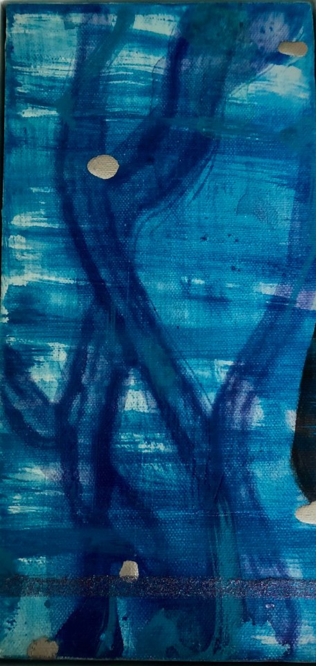
Roeder hopes that viewers of her work “take away a re-appreciation for the blues of the Pacific, the nearly synthetic pinks of sunset, and the glistening whites of Sierra snow, and San Clemente sprays of white from the waves. In some of my work, I have been inspired by a long walk at the beach with the green of kelp interspersed with the black of mussel shells.”
San Clemente series
 
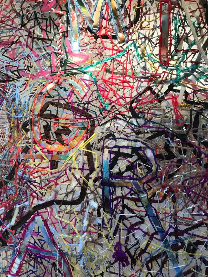
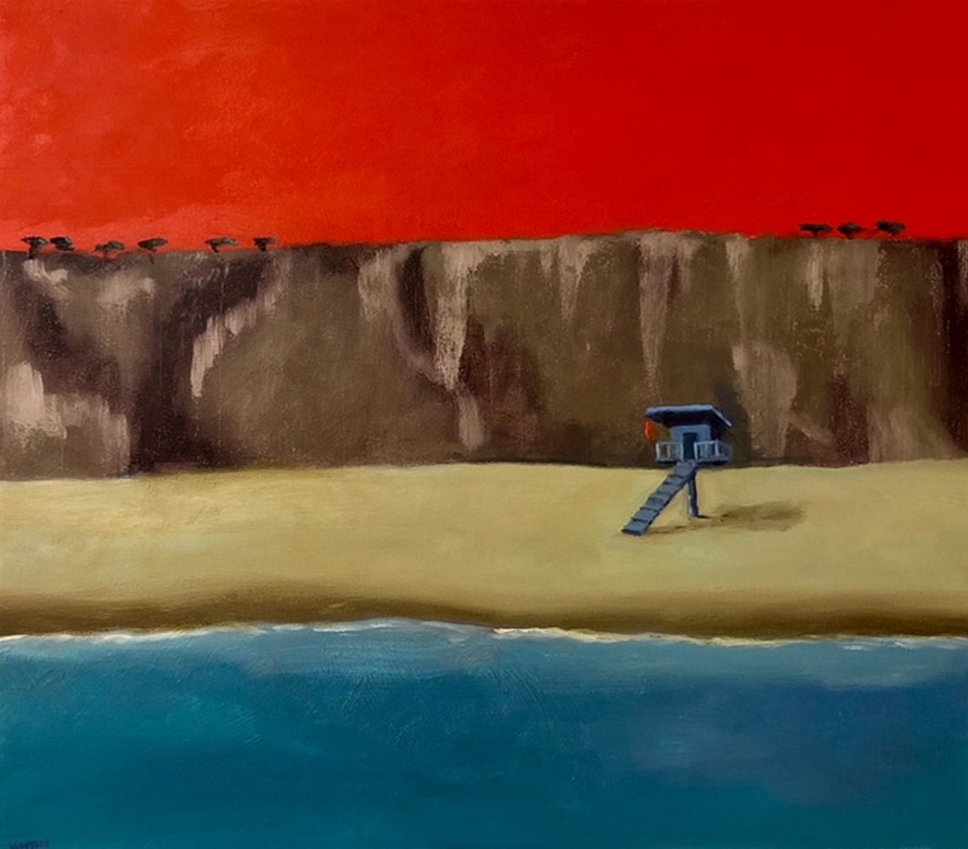
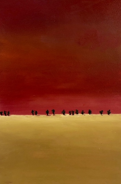
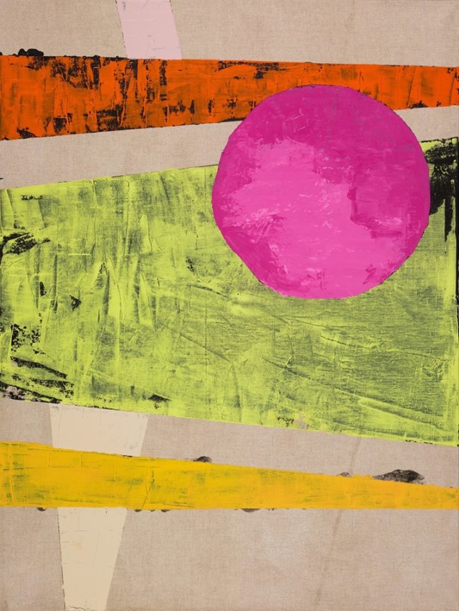
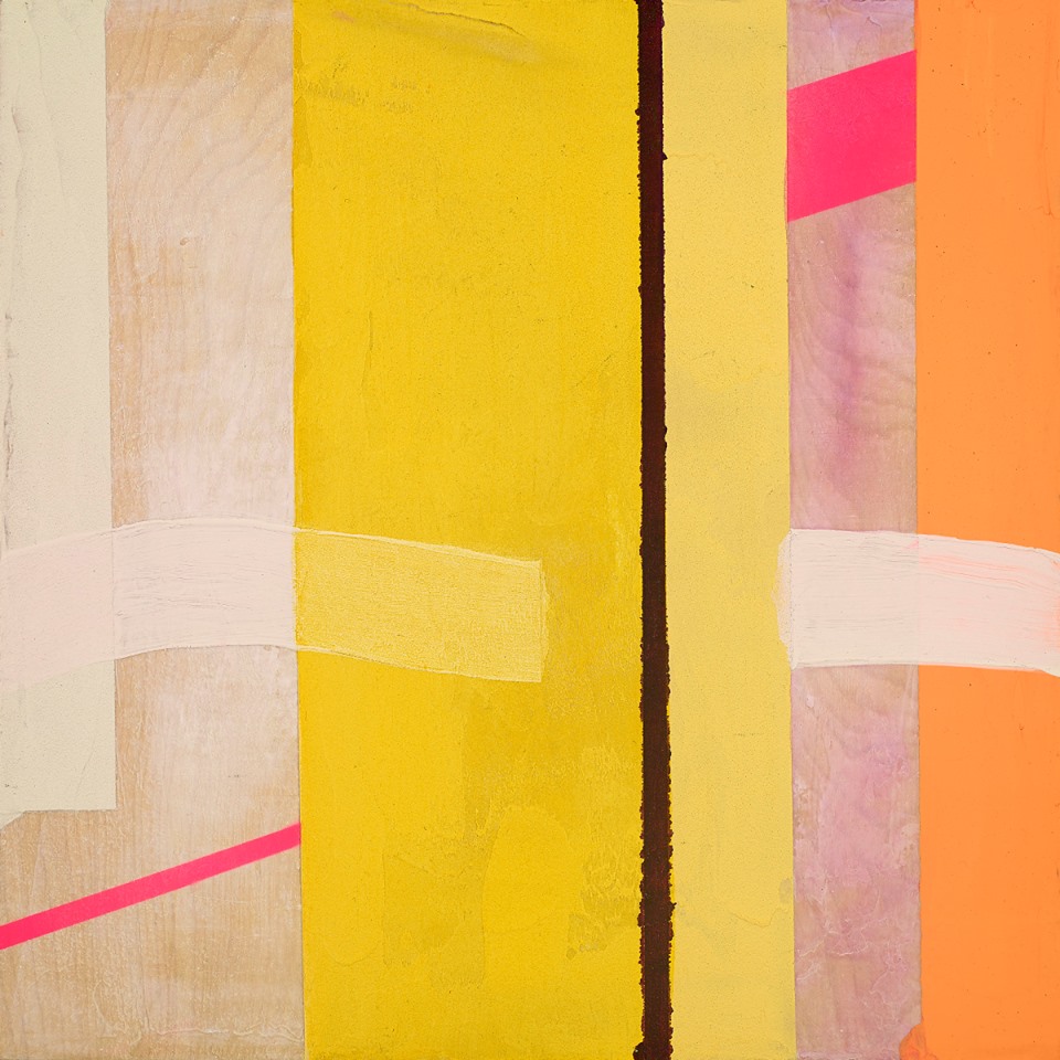
Roeder has worked as an artist all her life, and is today “continuing to explore my San Clemente Series,” lush paintings that evoke sea, sky, and sand (above).
  
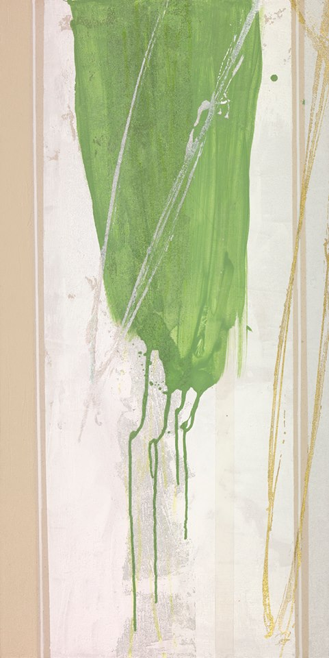
She says her color palette is “anything derived from the ocean –  from kelp, to waves, to foam, to tar, to coves, to huge swells, the night sky, the sand, the sounds, and the smells, as well as the unsurpassable beauty of Tahiti, Hawaii, California beaches, the great Sonoran deserts as far south as Borrego and north to Lancaster and northeast to Bishop – and the mountains that line all of this.”
It is a palette that vibrates with light, life, and nature; her abstract works seem to send energy right off the canvas. Her use of light, space, and color evoke an artistic environment that is entirely original and yet one which seems innately familiar – a kind of homecoming, perhaps, for California.
31239391_1923362414403387_6898771380746059776_n
To say natural landscape is the quintessential driver of Roeder’s work is not hyperbole. She’s in love with the “gently morphing” sunset colors; and sees “the browns and grays of the desert sand and LA as a neutral that makes the colors even more vivid.  The pines of the Sierras and the gray green of the oaks are not absent from my palette, often referencing them with a line like a pinstripe on a Mustang Convertible,” she explains.
30729324_1918463461559949_8974067456112852992_n
Darkness, too, gets its due. “Even the dense fog, black nights, and the red tides have influenced my color sense.”
30703738_1910076435731985_4377514754952921088_n
She adds that “Once I realized that nature can be as neon as it gets, it seemed to justify my use of neon, interference, luminesence, and all things shimmering.”
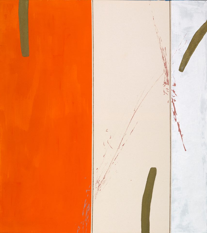
Her colors are textured and rich, with a depth that seems to come naturally to her in her use of layers, and overlapping colors. Roeder says this visceral quality has not always been the case with her work, which has grown more textural in recent years.
“Combining mixed media collage, acrylic, and ink, and acrylic pens with glazes and full body acrylic with even mediums that make it even thicker, has become interesting and vital to me,” she relates.
37780502_1796464567128230_4142062693576081408_n
For Roeder, her technique and mediums all come back to the landscape itself. “I like to think again to nature where everything is mixed: smooth against rough, thick against thin.”
As an artist, as well as a conduit for the natural beauty that she personally adores, she says she also allows the canvas  — or ground — to be part of the painting.  “It is both an historical reference to canvas as one of the main grounds for art-making, as well as a reference to the sound and look of real canvas sails, and a non-digital reference point.  I also just like the look, feel, neutrality, and perfect off-whiteness of canvas.  It adds a natural consistency and texture to the paintings I like.”
36898420_10214992074182505_2716769631665651712_n
Roeder’s work is as rich, varied, and jeweled as the landscapes she so admires – and transmits to viewers through the many-faceted dimensions of her art.
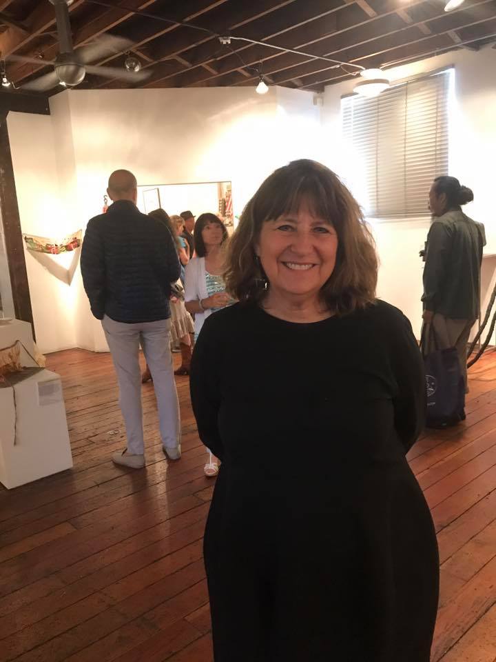
– Genie Davis; photos: Frederika Roeder

Tape Artist Chiho Harazaki in 3-Day Pop-Up

11828561_979053488783548_7831428060355171908_n

Coming to Venice August 17-19,  SOVO// Magazine offers viewers a chance to witness – and participate in – the creation of a ceiling-to-floor wall mural from LA-based contemporary tape-artist Chiho Harazaki.

11825745_979058108783086_7281799872125421534_n

What is a tape artist? Like a maker of mosaics, Harazaki, who was born and raised in Japan, shapes delicate work from fragments of electrical tape. Wielding scissors and precision knives, she creates fascinating, dynamic works that combine elements of cultural, historical, architectural, and lifestyle elements into elaborate depictions of scenes set in both Japan and LA.

11863356_979051508783746_4328943188351309107_n

The artist has worked in this medium since 2014, and its uniqueness enhances her cool, clean, and visceral style. She says that her life in Japan and now in the U.S. both inform her subjects and her art. Indeed, the meticulous nature of the work, and the lyrical aspects of her composition seem to have arisen from her heritage; while the boldness of meaning and many of her physical settings are pure Los Angeles.

17553796_1386622008026692_5092389038757421042_n

Harazaki’s work offers a fresh take on iconic LA locations such as Union Station and Sunset Junction, as well as a poignant depiction of children at play in her “String Game,”  salary men dining in Japan, and in a piece commissioned by SOVO, “Bookends,” she depicts busts of former President Obama and Trump at either end of a row of books, with titles between them depicting each man’s philosophy of life.

29136894_1723629624325927_2105327358578786304_n

“The refuse of tape: tiny, useless, leftover scraps; can become perfect components of an artwork. I found the beauty of imperfection in tape art,” Harazaki says.

17554506_1386627098026183_1225074061374226446_n

Her hand-cut shapes and lines resemble traditional Japanese arts such as woodcut and paper cutting, but are themselves  fascinating and entirely unique mixed-media works.

The 3-day pop-up art installation and music event commemorates the magazines second half-issue, ​[ Issue 2.5 ] and is planned to help attendees interact, break routine, and manifest understanding through art.

17458011_1386623208026572_17778911553800368_n

Harazaki, who will be present throughout the exhibition dates, says “Let’s focus on growing love. Play together. Know each other.”

She will be working live on a large-scale artwork, offering a rare chance to see her unique, process in action. And, in addition to viewing Harazaki’s original works, a limited edition T-shirt, designed by the artist and produced by SOVO//, will be available for sale. When worn in front of each of the murals Harazaki makes, the shirt creates the illusion that participants are standing within the artwork itself – Instagram ready. Art prints of three of the scenes from the exhibition will also be available to view and purchase by special order.

The immersive event unfolds at 214 Lincoln Blvd., in Venice, August 17-19. Hours are 5-11 p.m. Friday, 12 noon to 11 p.m. Saturday, and 12 noon to 5 p.m. on Sunday.  A variety of live performances including music, DJs, hula hoop, and more will take place over the 3-day period.

SOVO// is a new quarterly, high-concept print magazine produced in a limited edition; art-and-music-oriented events launch each issue and half-issue.

  • Genie Davis; photos: provided by the artist 


Diverted Destruction: Found Objects Rediscovered as Art

36189242_10214894788670428_9152791623803863040_nAt Loft at Liz’s, gallerist Liz Gordon, above, presents an annual exhibition that is dear to her heart, one that is pivotal both in terms of the art itself, and as an aesthetic for the LA art community.

36188216_10214894790830482_4717128350307450880_n

The 11th annual Diverted Destruction exhibition, now at the La Brea gallery through August 20th,  is a continuation of this popular, provocative, and ultimately profound concept. Gordon offers her reasons for the exhibition – and more reasons for you to visit.

She originally conceived of the show from her “other” life as an antique dealer.

35296505_10214894793470548_5246044119586832384_n

“Throughout my 40 year career, I have had to decide on the value of millions of pieces that have come across my path.  It has always been a struggle when I know it is impossible for me to sell an item because it is broken or perhaps too new, or not my specialty, as to what to do with it,” she explains. “I have always had a section in the store labeled the ‘Artist Boxes,’ these items were always sold at a fraction of their price in order to encourage artists to use them,” she notes.

36051152_10214894794630577_2749767234040627200_n

Once Gordon became a curator and gallerist,  she began to accumulate these items and store them, ultimately conceiving the idea of her Diverted Destruction show.

36261494_10214894794550575_7576537432170954752_n

“This happened within the first year of starting the gallery,” she reports. “I have always had an affinity for found object, assemblage art.  I think now more than ever, we need to rethink how we deal with our garbage, and artists are the perfect people to inspire us.  We need to keep as much as we can on the land, In lieu of in it.”

36176471_10214894793190541_518644007098646528_n

This show is a little different than previous incarnations. Gordon curated the show with only female artists this time around.

Her reason? “We continue to live in a ‘man’s world’….and look what they are doing and have done,” she exclaims. “It’s time we give women the platform and maybe, just maybe, the approach would be humanity first,” she states. “In addition the women are from a variety of cultural backgrounds: Mexican, Iranian, African American, Philippines, Chinese and American.” That inclusiveness reflects a larger theme for the exhibition.

36053098_10214894792270518_3255278528228229120_n

“This year, the theme within the medium is a sociological one dealing with the current human condition. The show has evolved throughout the years to encompass specific mediums,” she explains, as in past iterations, titled Diverted Destruction: The Paper Edition or The Fabric Edition

The work is always done with materials that are destined for, or found in the trash.

36114317_10214894790070463_5429469537005207552_n

“This show is relevant for all of us if you look at the materials, and realize that each of us walks to the garbage with things that can be reused,” Gordon enthuses. “Take the mesh bags that fruits and vegetables come in. Instead of ripping it open, cut it cleanly and it can be reused for so many purposes.  This is one small example.”

Gordon says her close personal connection to this exhibition makes it easy to curate. “It is an extension of what I do everyday in the store.  My appreciation for objects extends to the garbage.”

However, she is strongly aware of finding an underlying theme to add meaning and depth to these exhibitions. “This year, that took seeing Hai Wei Wei’s documentary Human Flow to inspire the theme The Human Condition.”

For Gordon, the film resonated on a number of different levels. “Those people who have found the courage to leave their homeland with virtually nothing but the shirt on their backs have no choice but to live on what is thrown away,” she asserts. “They have to have enormous resilience and resourcefulness in order to survive.”

36188522_10214894795550600_5282179388845064192_n

The feedback for this year’s show as well as for past exhibitions has always been positive; her generous offering of art materials from discarded items she’s collected over the course of a year is a highlight for many art-makers and those simply interested in finding treasure in another’s trash.

36034627_10214894794190566_2382000793780748288_n

“I used to just throw all the items on a table in a huge melange, but as of last year, I created an installation that is virtually a mini Liz’s Antique Hardware, equally as organized. Because of this order, the items resonate as something other than garbage.  I believe people are inspired and see their potential and their beauty.  We hang a sign in the store window saying ‘Free Art Materials.’  It literally stops traffic, so many young people are coming up to the gallery and taking things.” Gordon continues  to add items and change the installation throughout the run of the show.  “It continues to inspire me and those that partake in the offerings,” she adds.

36222913_10214894794470573_5798445766473154560_n

Gordon finds a link between the use of found objects, recycling, and creating new forms from old, with the mission of the artists she chose for this year’s show.

35923017_10214894791510499_8301297186092613632_n

Above and below, the work of Ching Ching Cheng.

36228282_10214894791910509_2905835092762951680_n

36088312_10214894792870533_6484564077589823488_n

Above and below: haunting images from Camilla Taylor.

36002422_10214894793390546_3655406005170208768_n

“Each artist deals with the theme from their perspective, using recycled items to express their idea of the Human Condition. Ching Ching Chen deals with motherhood. Linda Vallejo did her work 10 years ago with images that continue to confront the same issues today: ecology, genocide, war.  Marjan Vayghan’s installation of a found-dollhouse represents the death sentence Iranian women are given upon marriage.

36064219_10214894791950510_1573771601751572480_n

“Alexandra Dillon’s portraits of refugee women (above) subjected to cruelty beyond our imagination, and Kathi Flood’s collage all deal with the current immigration issues,” Gordon attests.

36063986_10214894789190441_4204166241344028672_n

Diane Williams, above, also offers a strong invocation of the immigrant experience.

36137373_10214894789630452_743427030409805824_n

Gordon suggests that to learn more about the artists and their use of materials, the upcoming Artist Talk this Wednesday the 8th, and a free Adult Workshop on the 11th, will both offer deeper insight into the meaning of the exhibition.

Upcoming Events:

Artist Talk, August 8th, 7-9pm

Free Adult Workshop, August 11th 1-4pm

Free Youth Workshop, August 18th 1-4pm

Closing Day August 20th

Loft at Liz’s is located at 453 S. La Brea in mid-city.

  • Genie Davis; photos: Genie Davis

Glenn Waggner – The Stories He Builds

38433245_10156666266094884_497675203665461248_n

Glenn Waggner’s artistic mythology is that of a storyteller with a perfectly rendered aesthetic. A SoCal native, Waggner riffs on familiar images painted in meticulous, diminutive style. His background in architecture shows in his perfect composition, but his oil works are rich microcosms, worlds that viewers can step inside.

DesertHouseWithoutFencing

“Desert House without Fencing,” above.

Waggner says that his works reflect his intimate visual relationship with his home. “Growing up, I spent every summer day at the beach, and think the light and color from that show in my painting.” He adds “I have worked in architecture for many years and am fascinated by buildings, cities and how things work. I like to take the light, details, and ideas to create a world that is slightly different from the one we live in.”

WithATwist

Above, “With a Twist,” a drink one could swim in, like the backyard pool in an LA-home.

His works are designed, he says, to “spark someone’s thoughts and imagination” and cause them to “think of, or imagine, an experience. I encourage the viewer to create their own narrative of what the painting means, and I love it when they see something I did not consider. It creates a dialog and connection.”

There is a strong riff of humor and lighthearted mayhem in his approach, which may come from the fact that he has “always” sketched scenes or cartoons. “I started painting almost twenty years ago. My day job is in architecture, and for years I tried to separate the two, sort of a church and state relationship. When I finally combined them, everything took on a whole new aesthetic and opened new possibilities.”

Lift

Above, “Lift.”

Wherever Waggner exhibits, his work draws viewers in, seemingly through a wide, expansive horizon-line, pulling eye and heart to small, succinct figurative images often on the lower half or in a portion of the canvas.

ItWasConsideredGoodForm

Above, “It Was Considered Good Form.”

“ I do a lot of small scale work because I like the aesthetic of seeing brush strokes. I plan to do more large-scale paintings, and an 8 foot x 8 foot painting soon, which is much larger than anything I have done,” Waggner relates. “There is also a practical aspect in that collectors may not have a lot of wall space. It seems people with lots of wall space have less money, and people with lots of money have glass walls,” he laughs.

The artist’s work has evolved over the years. “My work started as having an illustrative look to it, then became more painterly and expressionistic. I like the idea of the painting having a story or narrative.”

KitchenCanOnlyHave1Boss

Exemplifying wit: “The Kitchen Can Only Have One Boss,” above.

His precise structures may be in part due to the fact that he thinks each evocative story through carefully. “My cartoons and sketches translate to stories on my paintings in many cases. I also like to have fun with titles, which always seem to come to me after the painting is finished.”

Plotting

In his recent “Plotting,” above, two men and a woman stand on the edge of a precipice, appearing to be engrossed in a secret meeting; behind them, inside an illuminated home, three executive-type office chairs are positioned. The piece exudes film-noir and a streak of wit – are they plotting a murder or a board room take-over? “Town House with Lawn View” gives us a long, narrow, expansive view of grass leading to a horizon line, above which swirling grey clouds prevail. In “Gliding,” a galvanizing yet tiny figure skater sails across a frozen expanse, dwarfed by a tree-lined shore and a rich orange sunset sky behind. We ask questions, shape answers from Waggner’s works; they are short stories as paintings.

In “The Tide Goes Out,” below, a vivid red sky is a-flame behind seaside cliffs; the perfect lifeguard tower poised on the edge of a flat blue sea. We have been here in our dreams.

TheTidesGoneOut

Waggner notes that above all else, he wants “to keep pushing new ideas. Hopefully more opportunities will come about by constantly working and creating.”

JoshuaTree

“Joshua Tree,”  above.

Asked about his paintings’ perspective and scale, Waggner proves that indeed, here, size matters. “Playing with scale can have powerful effects. It is fun to do a large, minimalistic painting and add small, very detailed elements like buildings or people,” he explains. “With small paintings, vivid colors and intimate details can be explored with a deceptively effortless look. There is an immediacy about the smaller scale, even though some take longer than the large paintings.”

These are intimate works, carefully woven, each note of color or line adding a bit of deeper nuance.

28279211_10156239951049884_4574048130731604151_n

“ I started out doing really colorful work, maybe a bit much early on,” Waggner muses. “Then I fell in love with using grays, and now I am somewhere in between.” He says “I do love color because there are so many possibilities and effects. It is sort of a language of its own.”

In Waggner’s works, there are multiple layers of language, of color, size, and story. His often vast backdrops pull the viewer in as we study, smile, and absorb the beautiful, sometimes ironic, always charged quality of his work. This artist tells a story, and he makes it live; these are breathing, moving moments caught in time and canvas, exuding energy and meaning, posing questions we want to answer or at least contemplate.

Here is where Waggner’s architectural background really shows: he is designing, building art that takes on more and more resilient shape and meaning the longer a viewer inhabits it.

  • Genie Davis; photos provided by the artist