Maya Kabat: Exploring Through Art

Maya Kabat Studio

Everyone, in one way or another, wants to explore the world. What that exploration means is different, of course, to every person – both in scope and in scale.

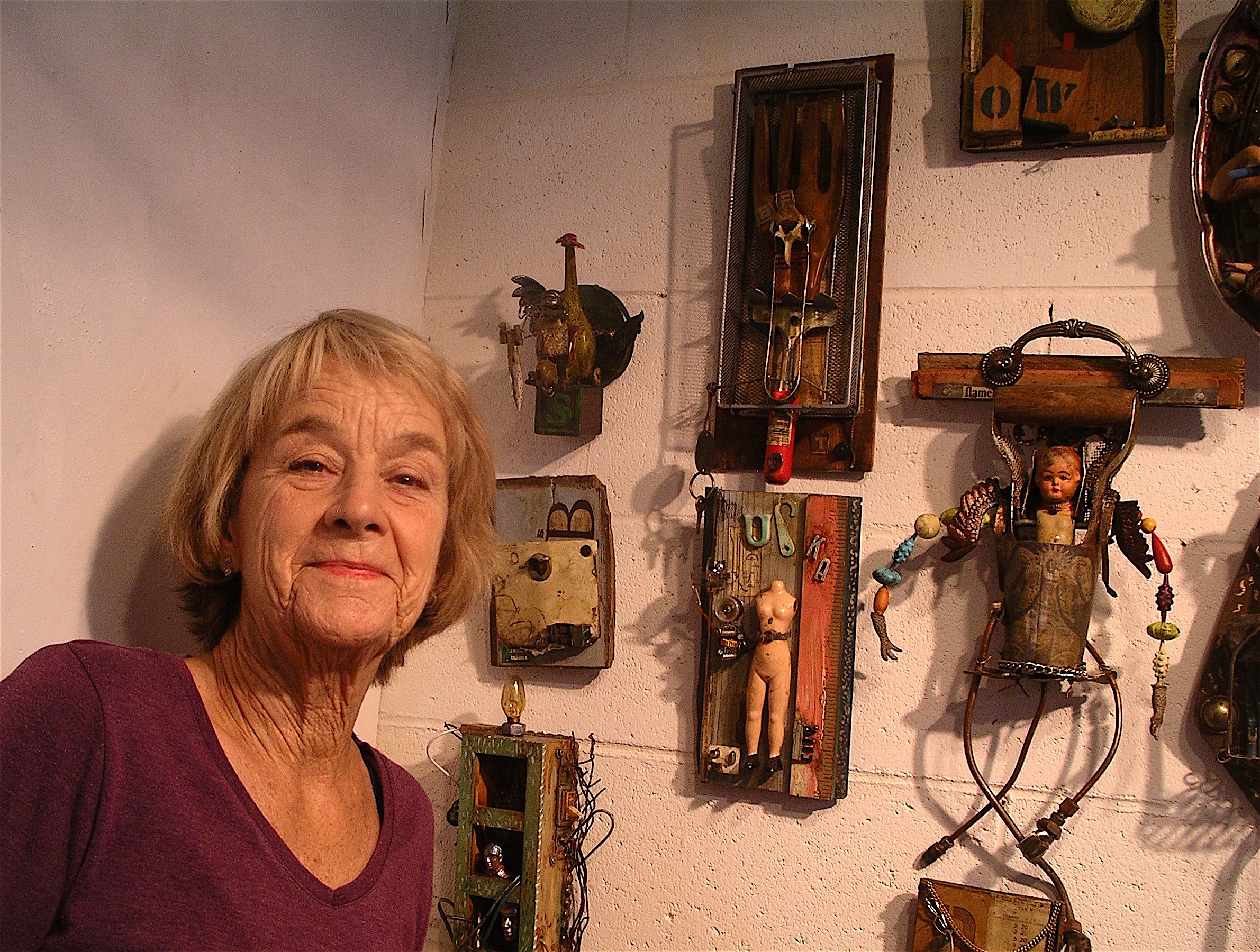
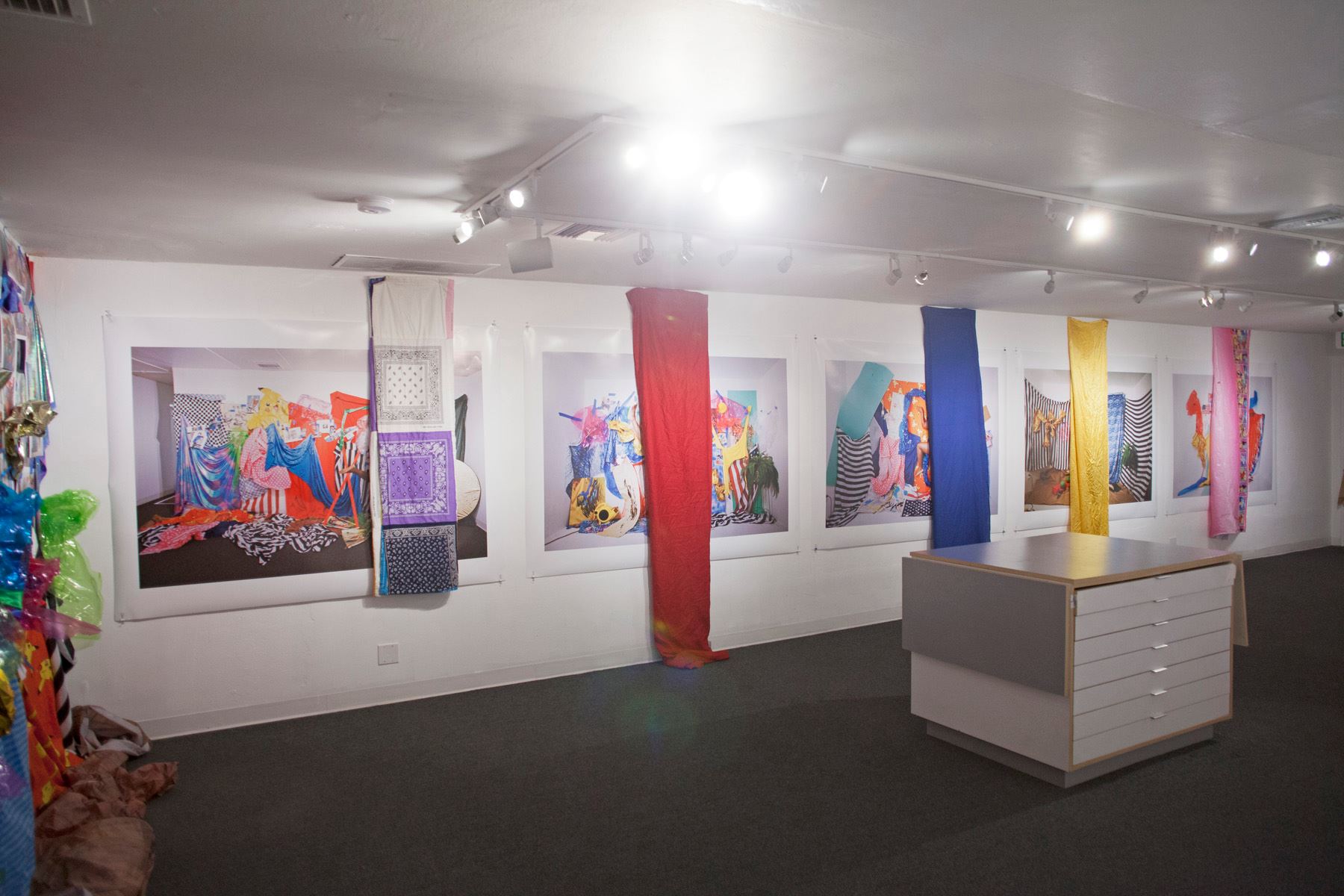
As an artist, Maya Kabat is vast and adventurous explorer, using two different mediums – paintings and mixed media – to examine the world she perceives around her. This results in varied, fascinating work; layered in concept and construction; colors that shift like sunset reflected on water or within the depths of clouds.

“My paintings and mixed media work evolve from very different places and fill different needs I have as a person and as an artist,” Kabat says.

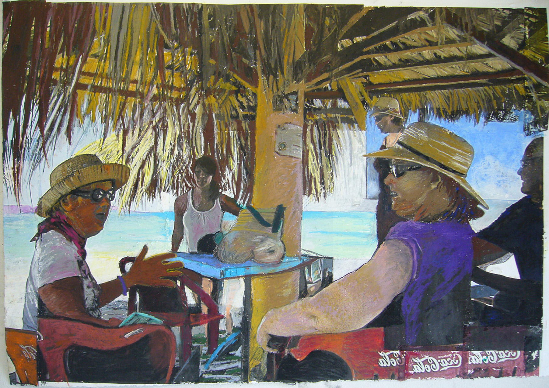
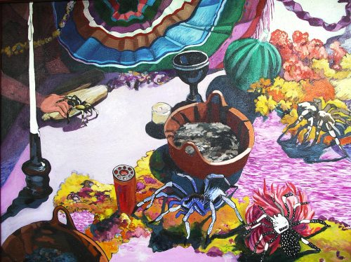
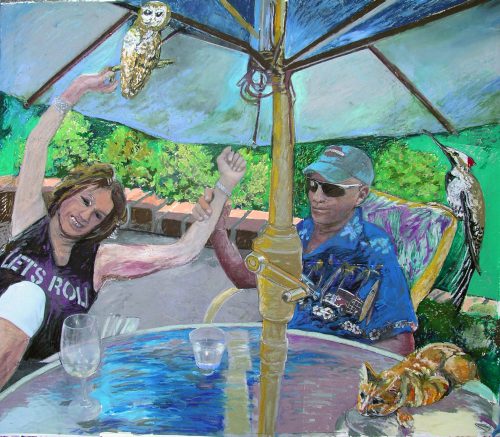
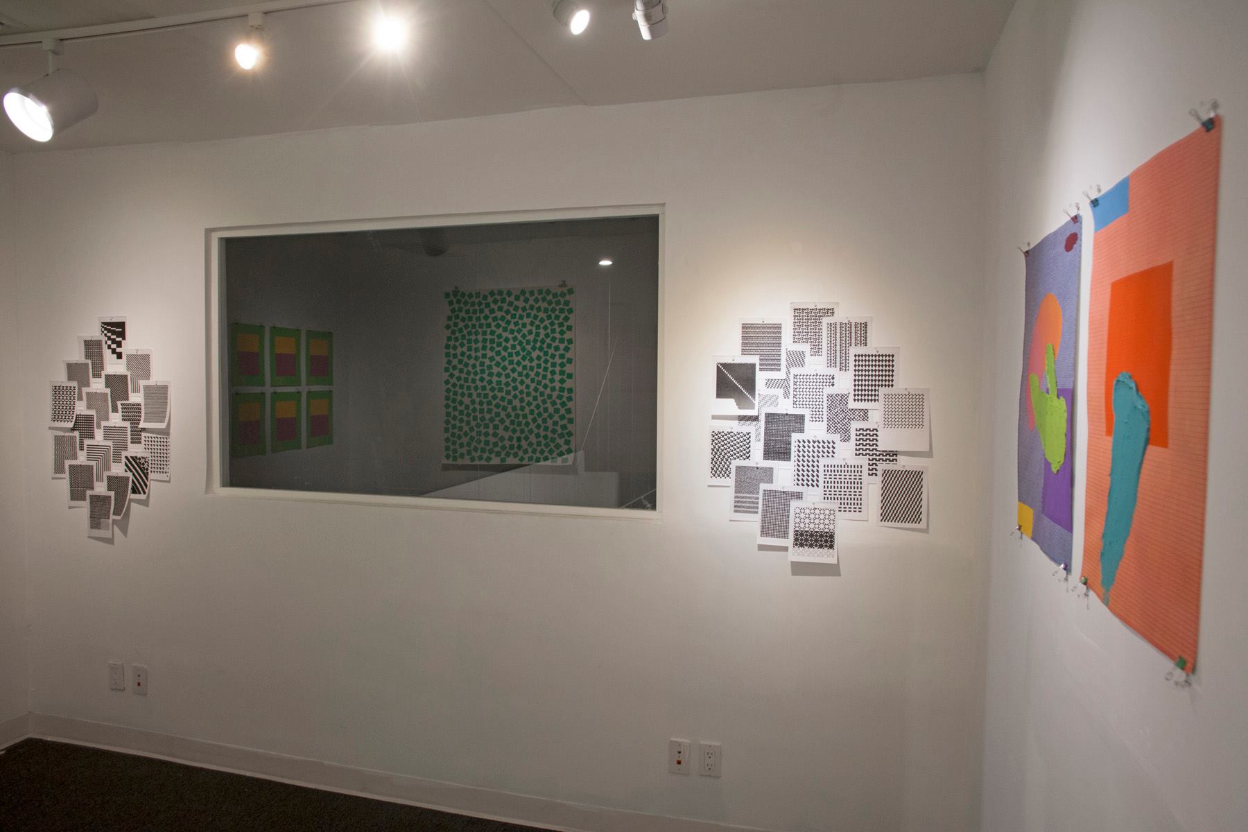
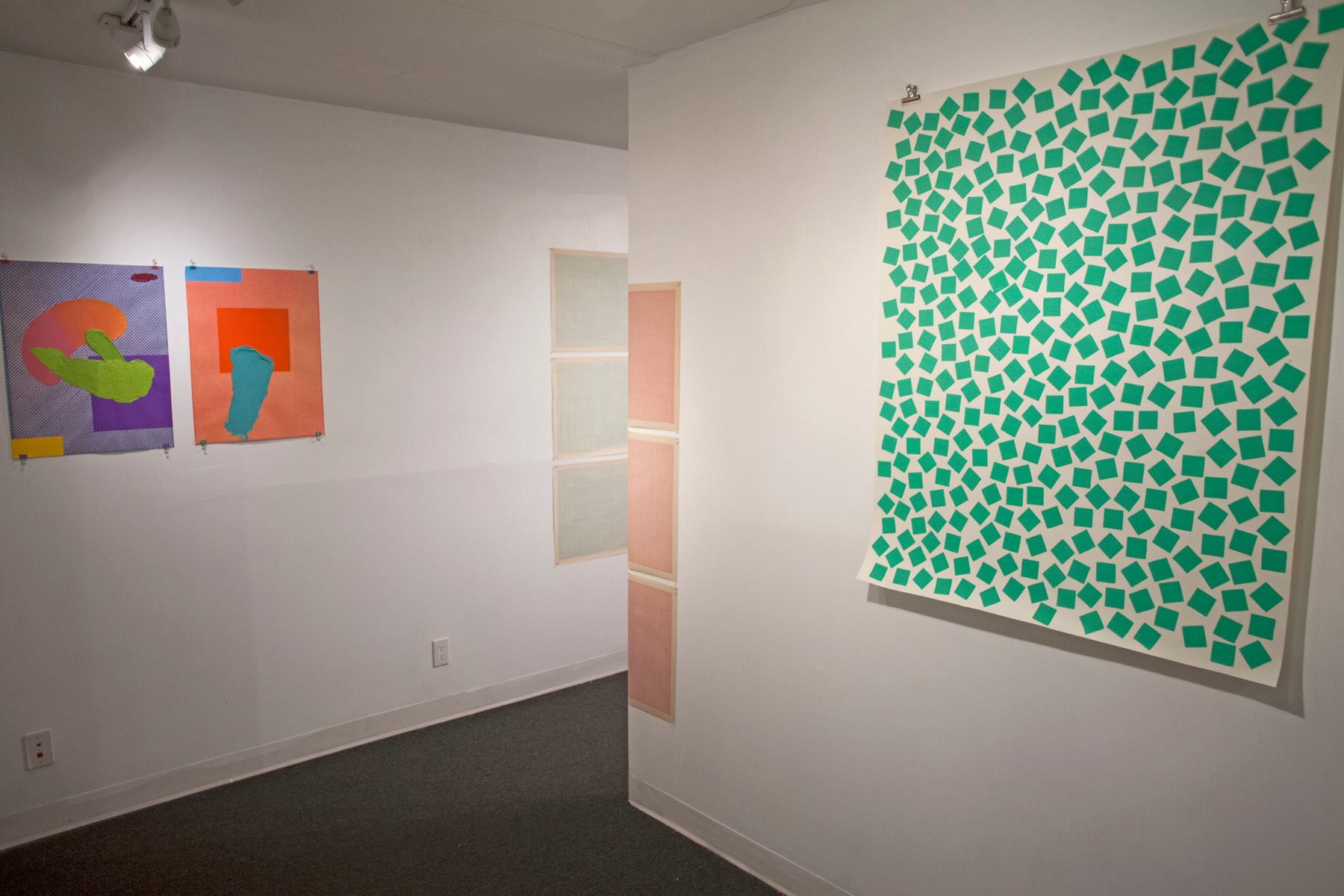
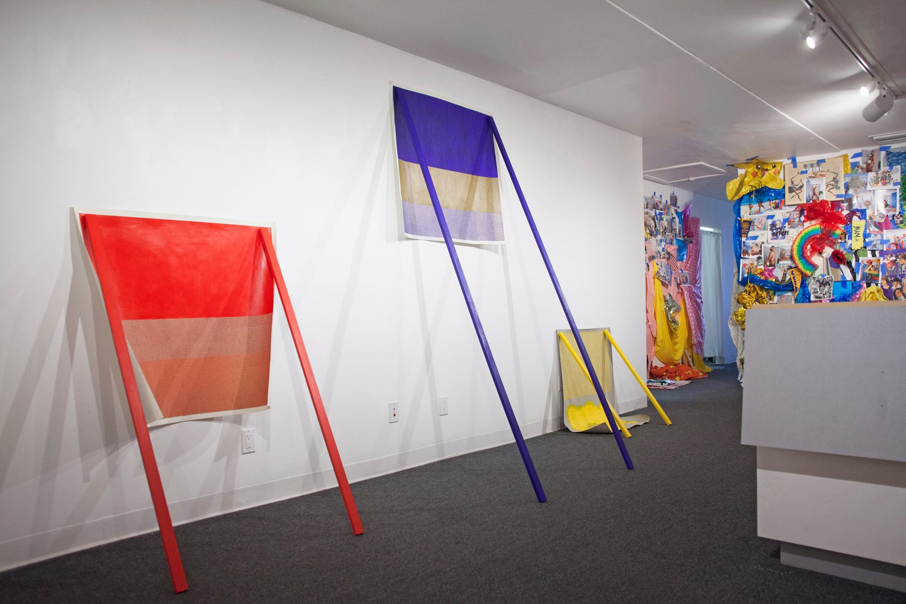
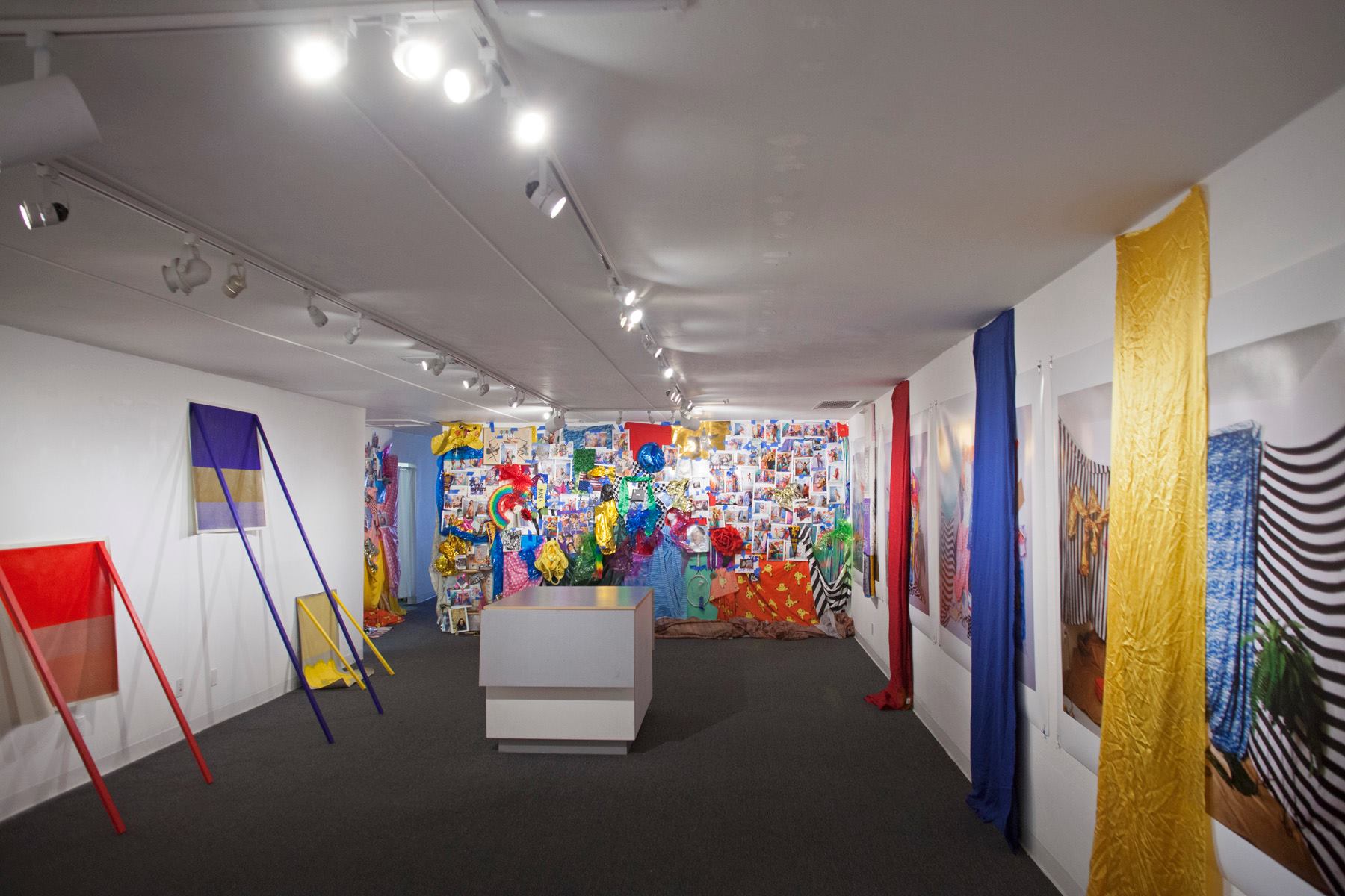
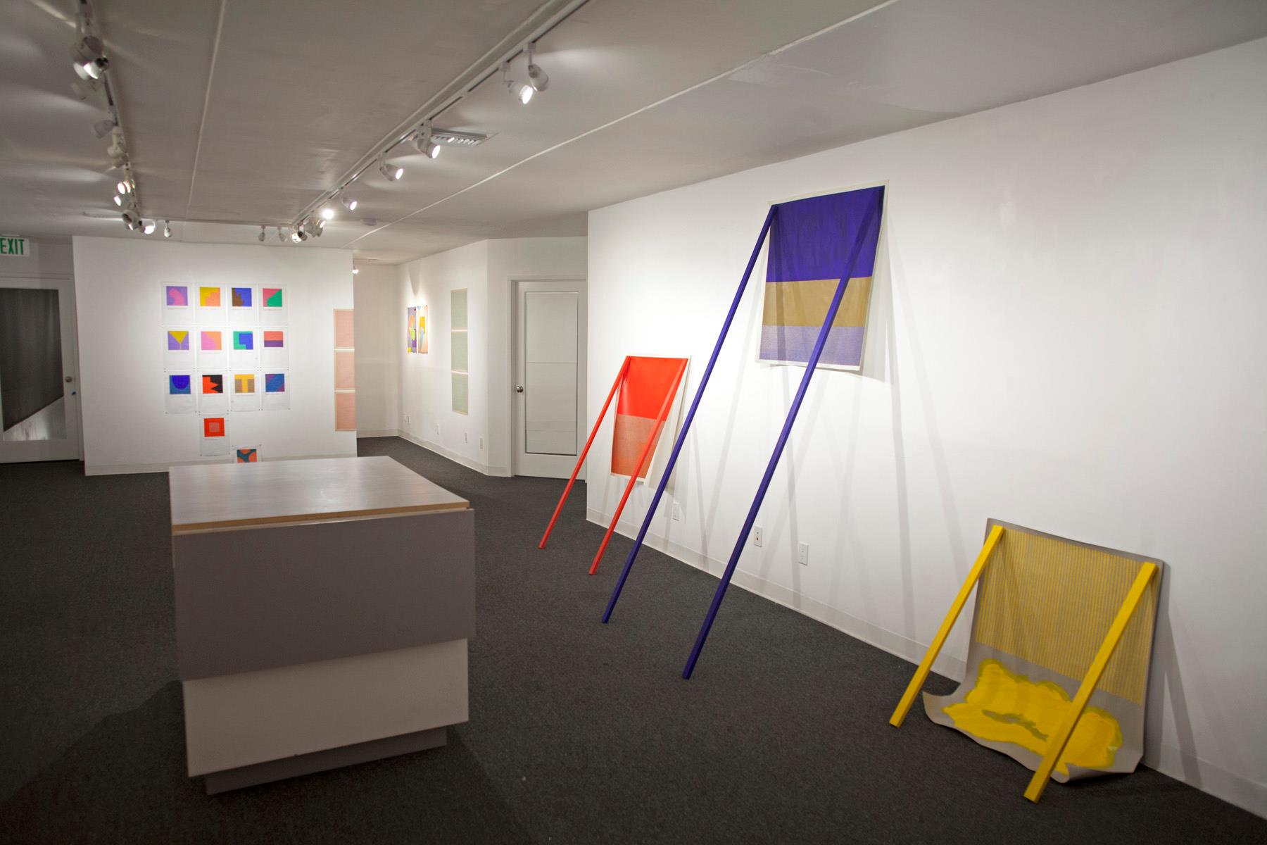
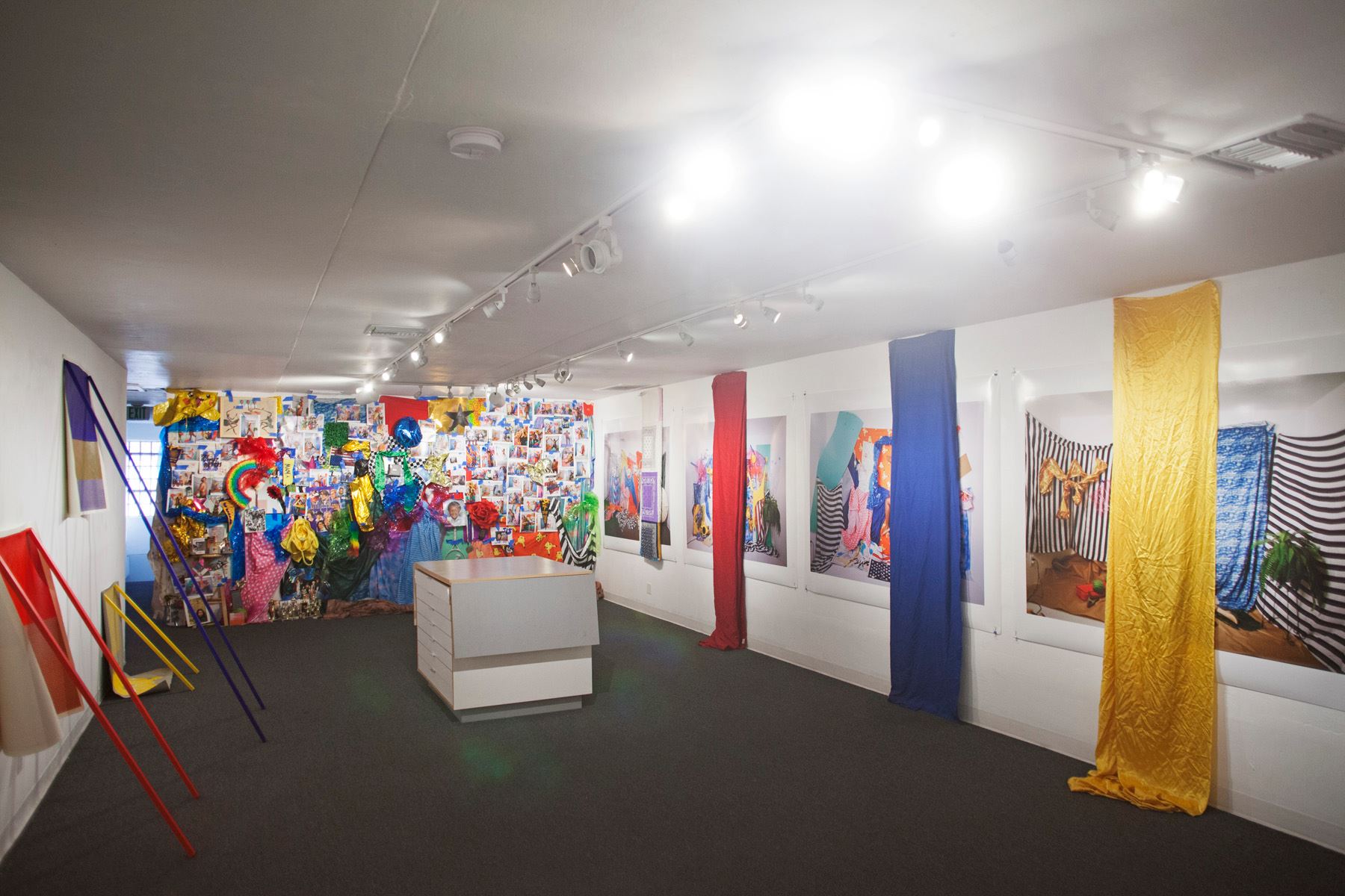
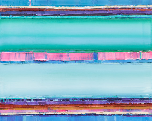
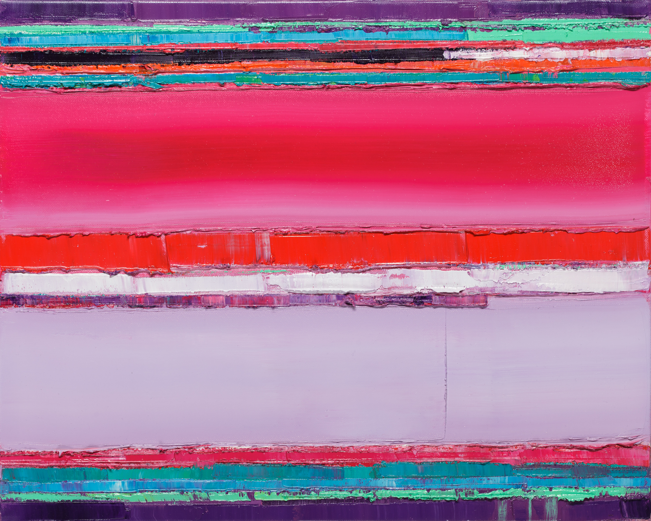
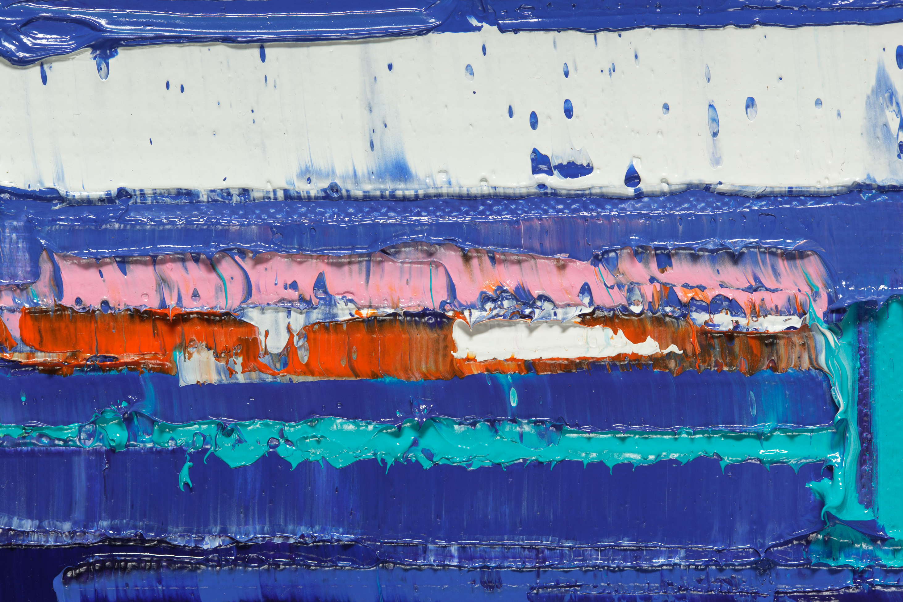
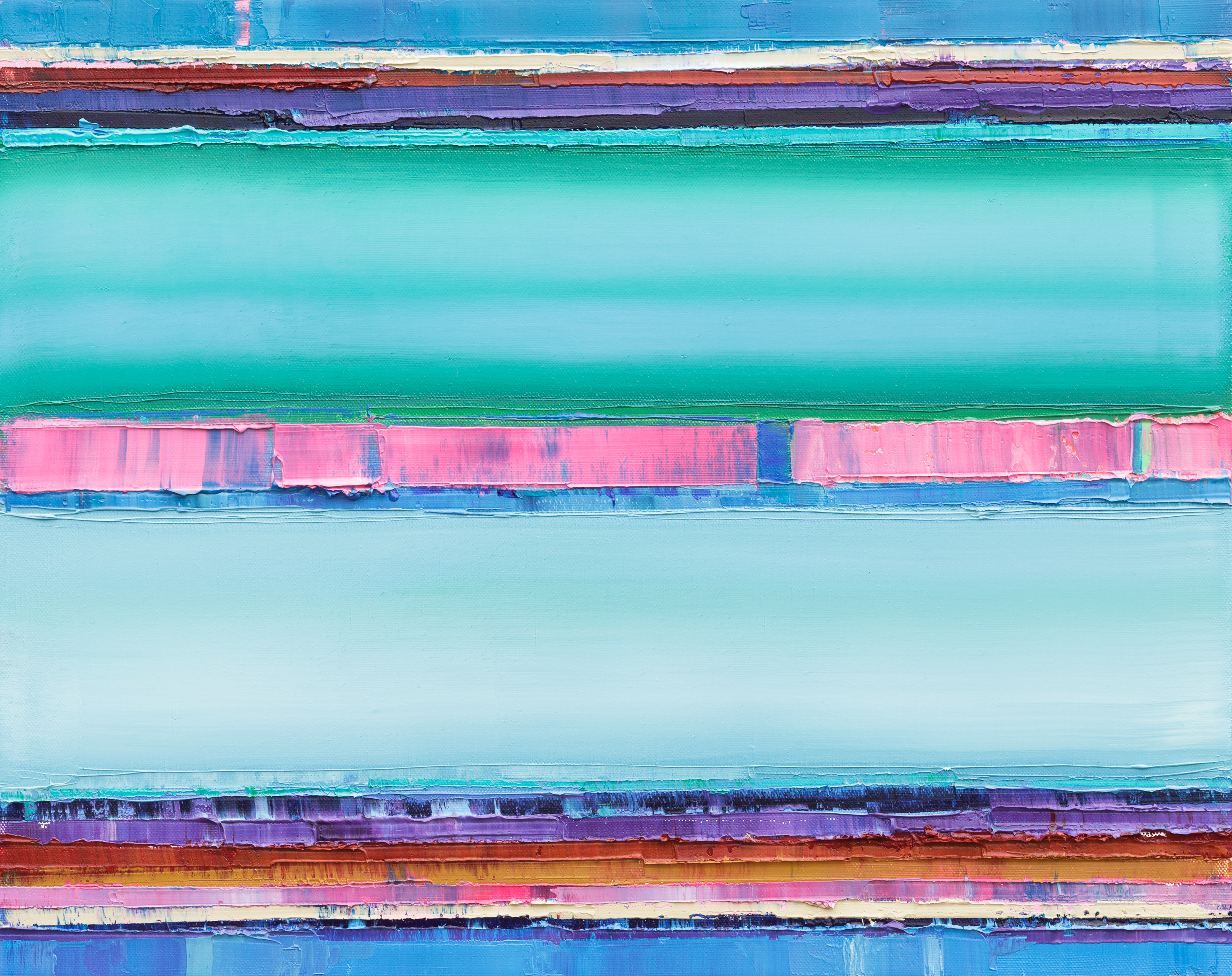
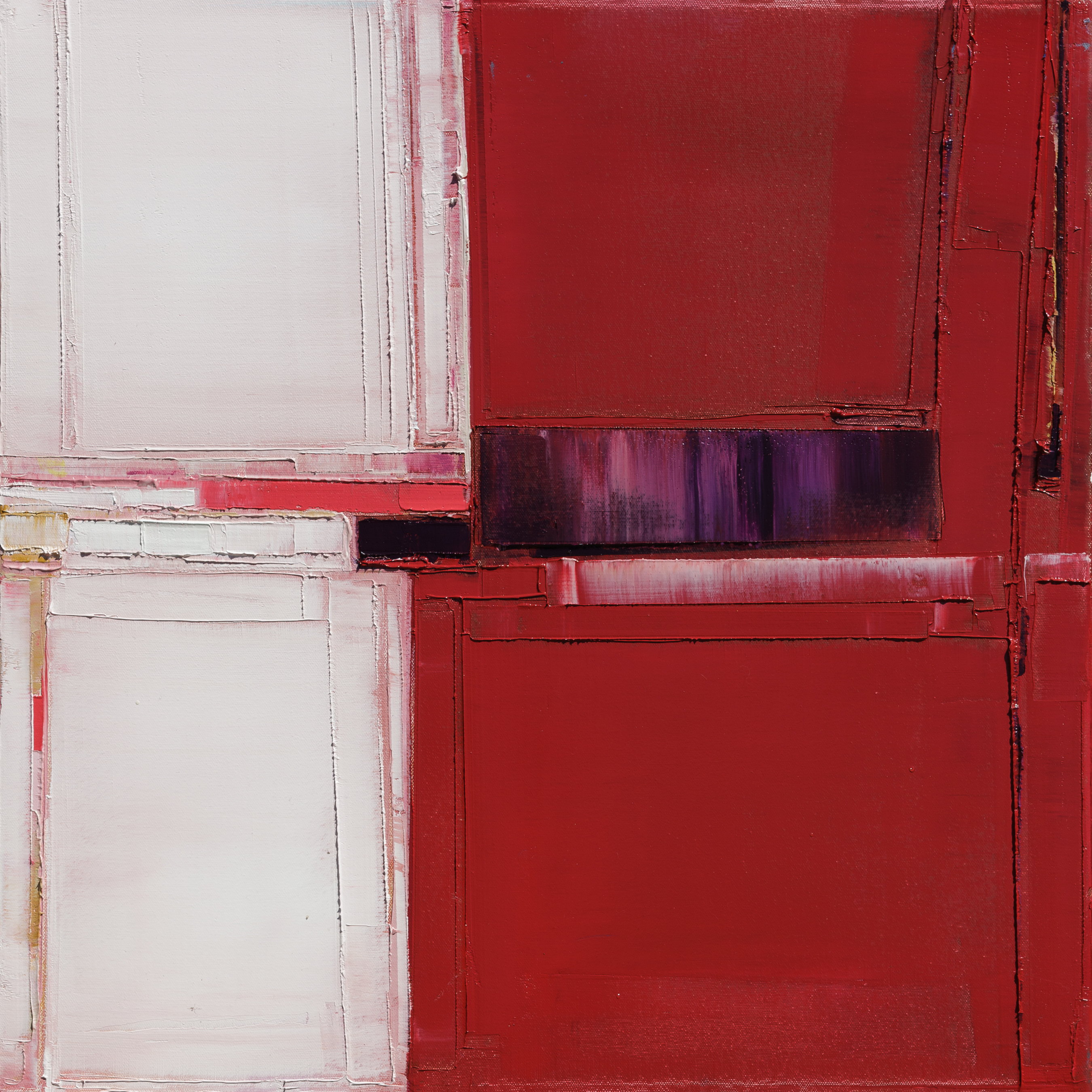
Her paintings are large and lovely, overlaps of texture and palette that feed one another.

KabatMCourse And Wythe 5-12x12 inches-2018

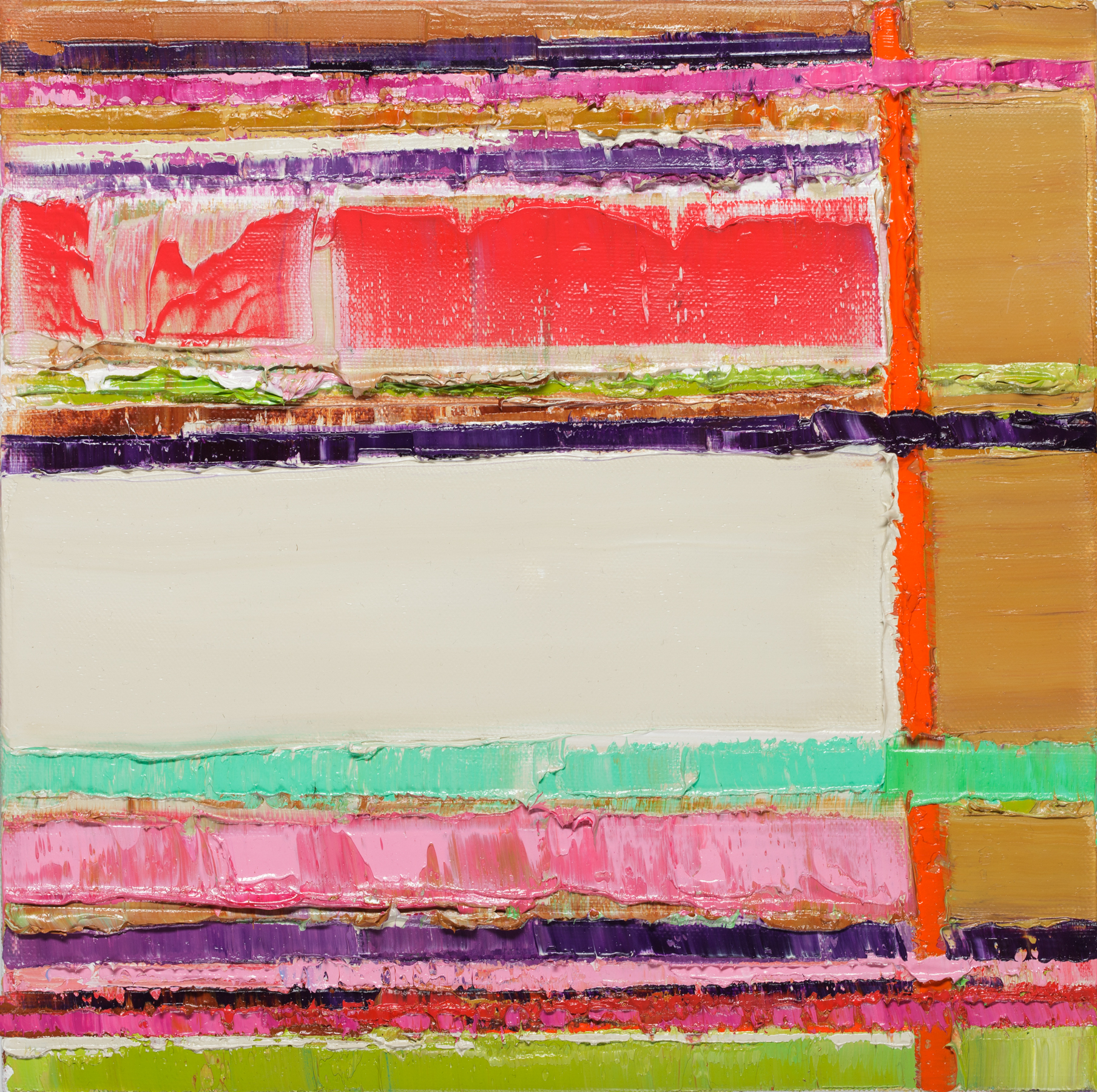
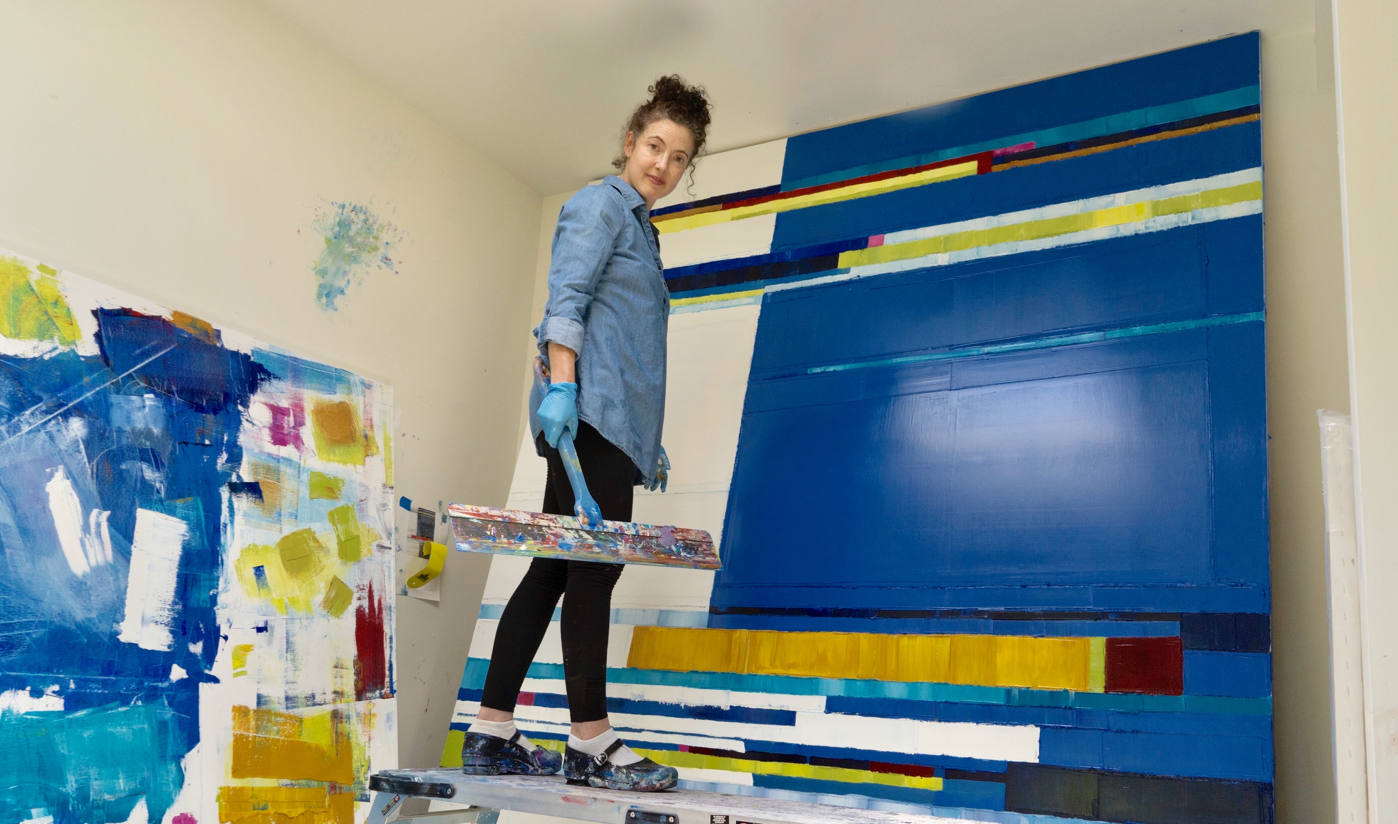
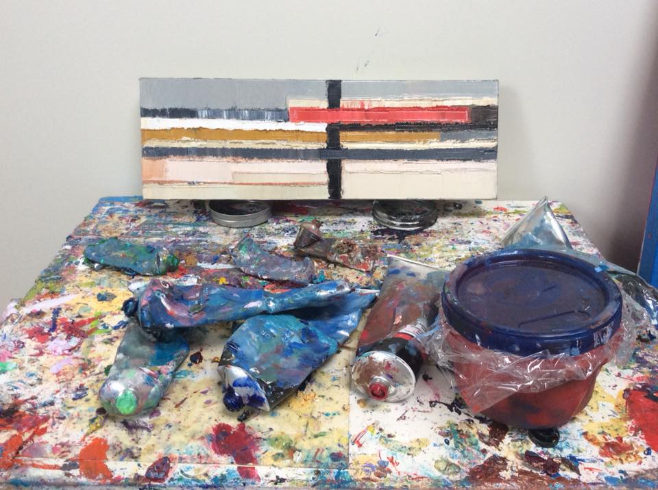
“My paintings are very physical and my whole body is involved with massaging a painting into being. For me, painting is very much like playing sports. I’m playing and collaborating with the paint and responding and moving with the flow of the piece. I’m trying things and then backing off. I’ll pull paint off if it’s not working.”

She notes that when she plays sports she’s interested in the beauty of the game, not winning or losing; she follows the flow.

KabatMReconfiguration23-20x20-2018

“I’m interested in…the timing and flow of everything, and the feeling of having a body in space that moves and moves beautifully when everything is right. It takes practice, but it’s the potential for beauty the drives me back to the court or field. My painting is similar as I’m very much in collaboration with the paint; the color, the shapes, the textures, and the structures. All of these things are driving me as I go, and I’m moving and engaged physically and responding to it all in the moment. Sometimes you hit it just right and sometimes you don’t! But the potential for beauty drives me along and drives my desire to practice painting.”

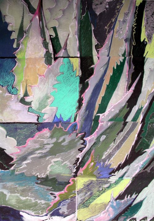
There is a fierceness and a sense of intrinsic movement, shifts of light as it were within her paintings.  They are bold and deep. Her mixed media work is more delicate, even transitory.

KabatM-Binary Code Drawing, Time Is A System-74x52-2016

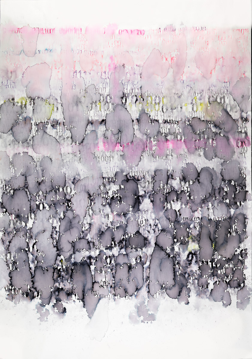
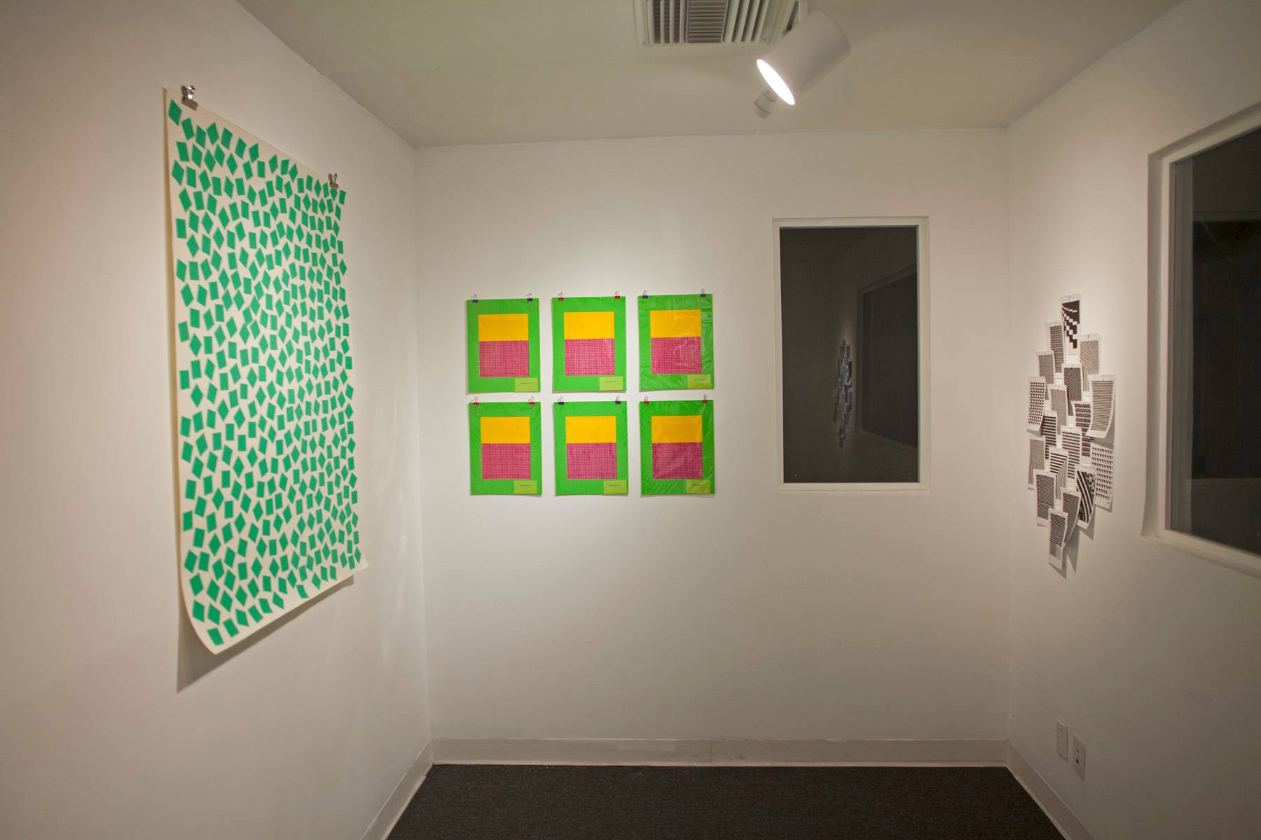
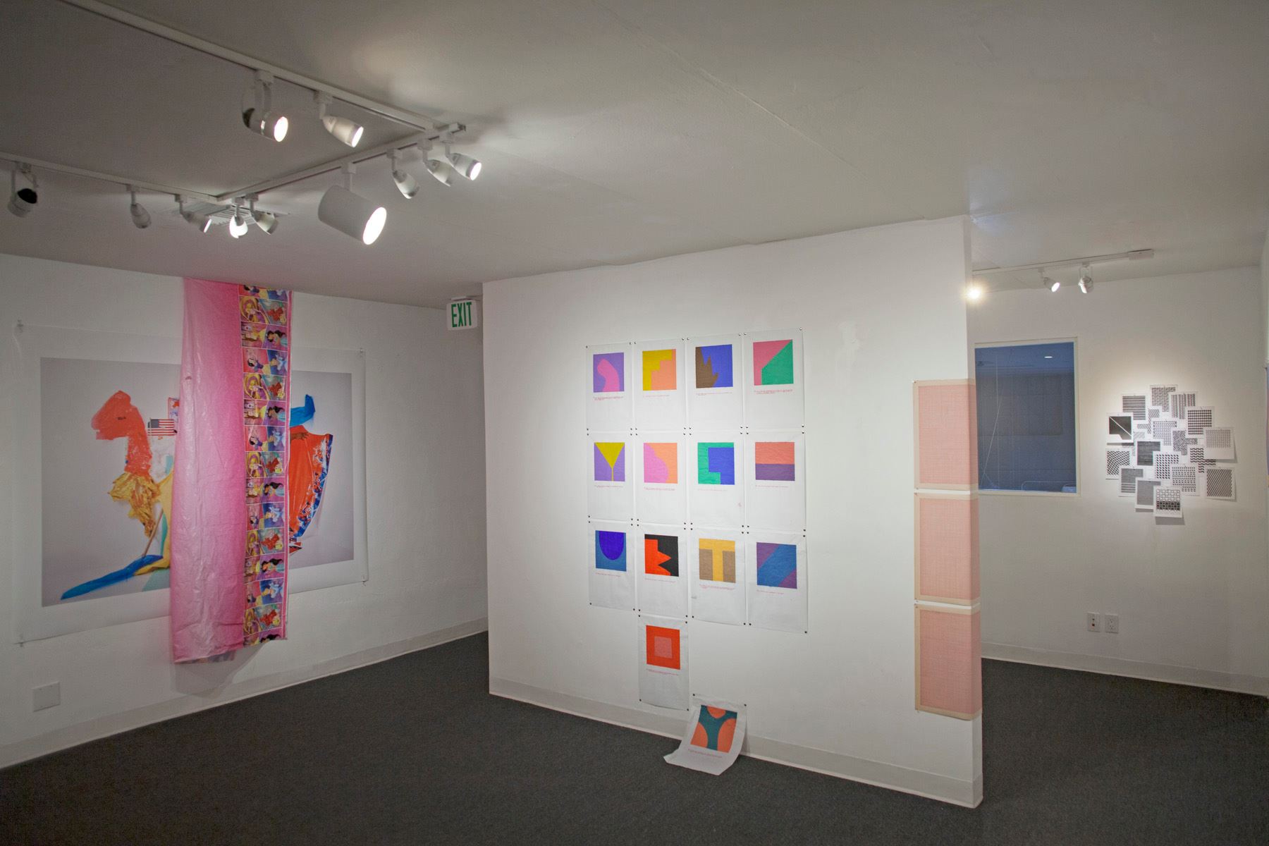
“My mixed media work on paper evolved from my need to draw and explore language – for me holding a pencil is inseparable from writing – and to explore other materials, and conceptual ideas. I work in series, and each series has lasted about 6 months,” she relates.

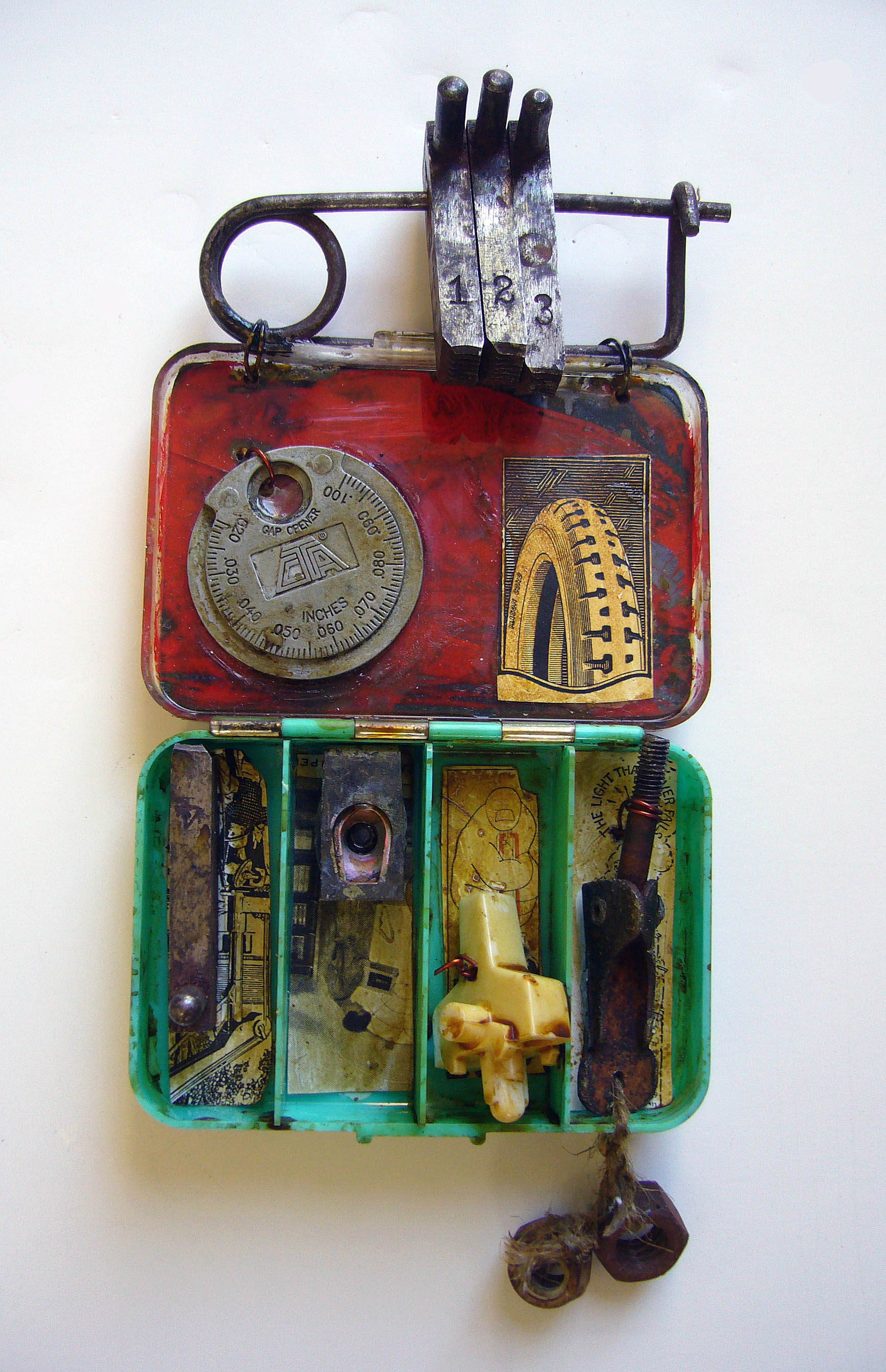
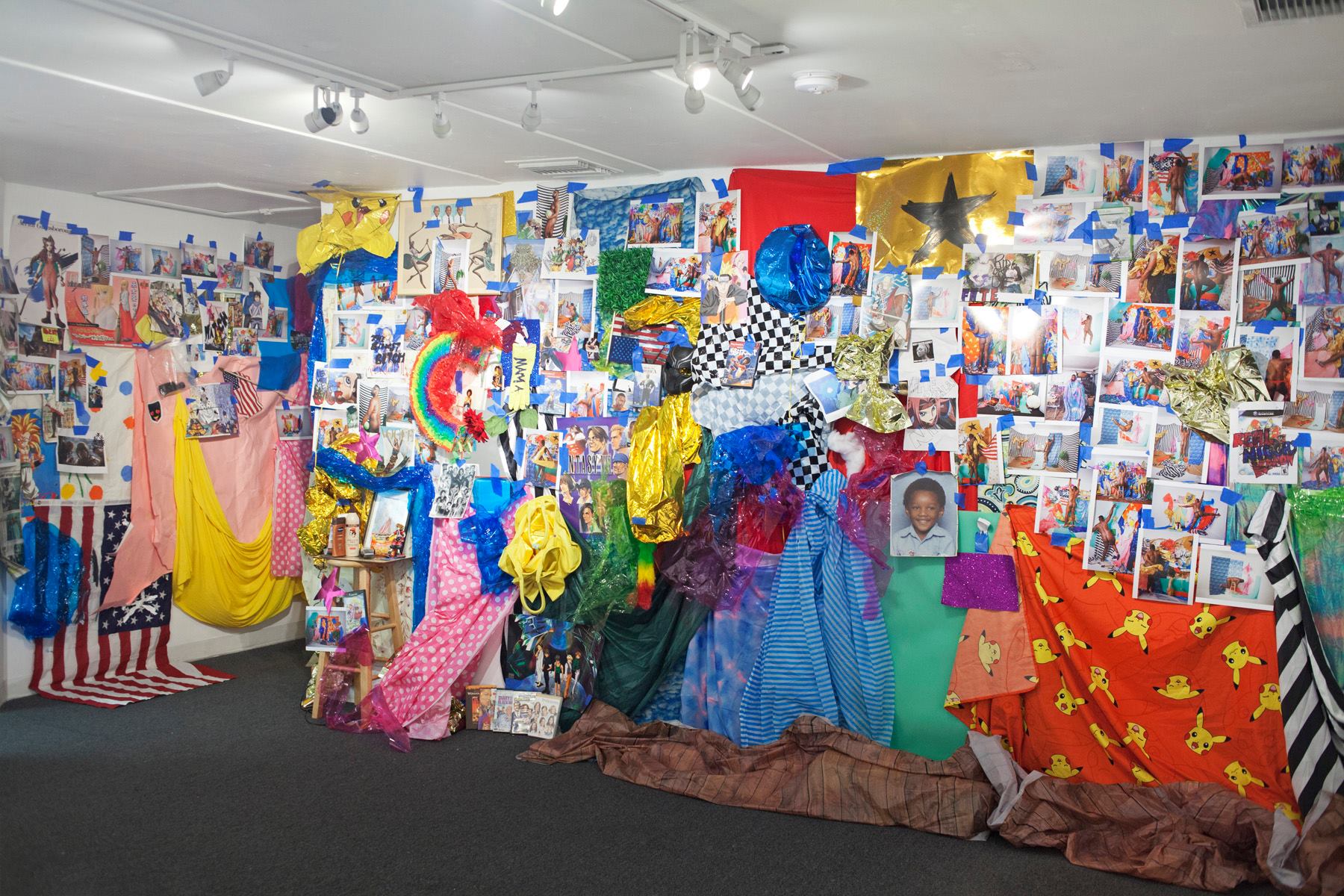
Her mixed media pieces seem measured, studied, and very much tell stories, even if they are mysterious tales to the viewer, who is invited to create their own meaning from them.

“In my mixed media drawing practice I’ve explored botanical themes, sickness – I was very ill for a period in my early 40s, binary code, war and the physics of time and space. Right now I’m exploring imagery derived from my trips to the Arctic, and another series about gender relations.”

She works with a wide variety of techniques and uses materials that range from stencil to water based paints, to acrylic pens to playing with freezing and melting ink.

“Working on paper is more flexible and transportable and so I’ll bring this work on trips and residencies where I could never bring oil paints. The dry time that oil paints require is so limiting. So the drawing/mixed media practice allows for me to digest lots of materials and ideas and conceptual themes. My oil painting on canvas is really one long, ongoing and evolving series.”

Kabat Maya Detail Attempt to Cross 30

Her work has an overriding feeling of perfectly planned geometry, combined with a truly spiritual quality that Kabat says is intentional.

“The painting process for me is very much about the physical nature of being a human being. We are human beings with minds, eyes and bodies. I feel that the haptic nature of our reality is really being subverted right now with our cultural obsession with screens. Our minds and eyes are stimulated incessantly while our bodies lie dormant.”

In a sense, Kabat’s work is exploring not just the world around her and the viewer, but the world inside us.

KabatMReconfiguration9-16x20-2017

“Spiritually, there is a connection with touch and our bodies that’s being ignored and lost. That’s why I meditate and do yoga and play sports and paint – so I can get out of my head and into my body. My paintings with their thick, visceral textures and pushing and pulling spaces are intended to be viewed with the eyes, but also felt with body. I really hope that people don’t just look at my work, but really feel it as well. The sculptural nature of my painting is hard to see in photographs, but it’s essential to the work.”

There is a quality to her work which makes viewers want to dive into them, to touch them at least metaphorically; their textures seem real, as real as water, light, sand, soil. She’s conceptulaized and created the techniques to shape her aesthetic based at least initially on her interest in texture.

KabatMAttempt to Cross 21-72x48 inches-2016

“I was a knitter as a child and quilted,” she notes, explaining that she attened UC Davis for textiles and received an MFA in fiber. But despite that, she gravitated to painting “for the speed and immediacy it offered; again, like sports, speed and immediacy are essential to my creative process,” she asserts.

When she couldn’t build the kind of texture that truly interested her from using brushes, she turned to other tools, eventually discovering the scraping tools intended for laying drywall compound.

“The tools changed everything from that point on: the movement of the tool and learning how to wield it to create lines, slabs and textures drove the development of the work from there. Compositionally, my interest in quilts and quilt makers like the improvisational quilt makers from Gees Bend always provided inspiration, as did artists like Richard Diebenkorn. Trips to Iceland, Greenland, and Machu Picchu also have had a big influence on my work and vision.”

KabatMGradeSeparation-24x24 inches-2016

Her color palette is also highly experiental, vivid and alive, what she describes as a push and pull of color. “I think that push and pull of color and form in space expresses another way we relate to the world, and the landscapes that surround us, with our bodies, not just our minds and eyes,” she explains. “When I was in Eastern Greenland on a boat sailing through the fjords and surrounded by icebergs and glaciers, scale and perspective were all askew. Since there were no typical scale markers like buildings or trees in that landscape, your only context is your own body in relation to the objects around you and it’s very disorienting.”

She found it was difficult to tell the size of an object if she couldn’t tell how far away it was.

“It’s exhilarating and powerful to feel like your body is so out of context, and it forces you to question your experience in the world in a very existential way, and to question your body in relationship to the landscape in a way we often take for granted. It’s very profound and overwhelming to be confronted by a glacier.”

KabatMGradeSeparation-24x24 inches-2016

Kabat says that she’s trying to recreate that sense in her work, pulling viewers into the works, and recreating the intricate dynamics of body, scale and space.

As to her use of color itself, she calls her work in that area evolving. “Mostly I’m trying to find interesting and unexpected combinations of colors. I think unexpected color combinations help us think differently; to see things with fresh eyes and maybe to open our minds to new possibilities. Each new series of paintings seem to require a different set of rules with regard to color. Every time I get comfortable I try and toss it all up and engage with new ideas…”

40239106_10155809837296801_2417814868204716032_n

To truly experience the colors, textures, and the physical and emotional depths of Kabat’s work, she wants viewers to experience it first hand. “In this age of computers I think we really miss out on the direct experience of art. It really does need to been seen and experienced first hand to be fully understood and appreciated,” she stresses.  

E1C081F7-6CE8-4028-9C74-12ED229AA5D9-e1538696176198

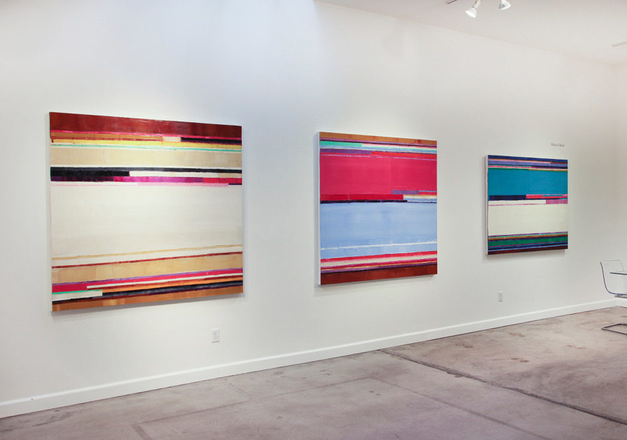
And viewers will may have a chance to do so soon. In the past year, she moved from a residency at the Sam and Adele Golden Foundation in New York to LA’s StArt Up art fair in LA in Venice, exhibiting around the Los Angeles area at a variety of galleries over the summer. “In November one of my binary code drawings will be in a show at Root Division in San Francisco, 140 Characters, curated by Margaret Timbrell and Lauren Etchells. Next year I’ll have a show at SLATE Contemporary, my gallery in Oakland, and also at The Sam And Adele Golden Foundation Gallery in New Berlin, New York.” She will undoubtedly show again in the LA area, too.  

And when she does – that will be the time to take a dive inside her work, to feel the shifts in her work, much as the tides shift, or metamorphic rock forms. You can see photographs of the outcomes of course, but being there to experience it, to explore the world – that’s the best of all.

  • Genie Davis, photos provided by Maya Kabat

Susan J. Osborn: Love of Life and Art

Susan 10 2018

Susan J. Osborn says that her “fascination with details, happenings, the wonder of it all, and a deep love for heritage” inspires her art. Working in drawing, painting, assemblage, and mixed media, her varied aesthetic matches her wide-ranging inspiration. “My love of life inspires my work,” she asserts. “And my observation as to what has evolved over fifty years in this world.”

A Beach Chat

Osborn began her career “s a magical realism painter, “most often reflecting sacred and feminist themes,” she relates. “But I soon found that drawing in oil pastel allowed me to show more energy, gesture, and movement  – and retain the vivid colors of my ideas in less time.” The vibrant color she creates with pastels serves her in good stead with many of the images she shapes, which often have a setting or vibe that feels lush and tropical. Her “Beach Chat,” above, is an example of this, the colors radiant, the setting as relaxed as a visual vacation.

According to the artist, “The ‘tropical’ feel in some of my drawings must come from the plants around me. I love to hike, camp, and be outdoors. My work can also be very Southwest at times.”  That setting is visible in works such as her painting “Parade of Tarantulas,” below. But no matter what the setting or subject, its the color Osborn uses that rivets the viewer’s attention.

parade-of-tarantulas-500x374

Even as she gravitated from paint to oil pastels as a medium, she taught herself to work in others. Afterall, she relates, she was teaching eleven different art subjects to high school students, and needed to prepare her curriculum quickly.  

male_female

Still, it wasn’t until the 2007 passing of her father that her interest in working with assemblage began. “I found that assembling the objects from my childhood home, and those memories of my parents, helped me move beyond the grief by giving new life to objects of the past,” she says. 

Hey Diddle Diddle

Osborn is nothing if not an artistic chameleon. “I have the urge to work with more oil pastel, drawing over digital photo transfers of Southern California life,” she asserts. “Of course my work in assemblage continues, and I hope to work larger and more abstractly.”

With all her work, she describes it as evolving from “a bit of born ‘craziness’ that is a natural genetic way of seeing. This gets combined with formal training in the arts and years of practice; ideas are constantly swimming in my head from what I feel, see and do.”  

Spoon Altarpiece2

When it comes to her work with assemblage, Osborn also finds that the materials themeslves inspire what she does with them. “I go to estate sales, resale shops, garage sales, and find things by the road. If something unusual pops out for me I have to grab it,” she attests. “The object becomes my muse and tells me what objects go with it.  I lay things in groups around the studio that eventually create the finished piece.”  The result: works that are often whimsical, as she shapes dancing musical figures from what was once dinnerware and wire, or creates what she calls the “Spoon Altar Piece,” above, which has a religious iconography to its design.

blue-agave-500x713

Turning again to her work in pastels, she has both figurative and more abstract works, as with her “Blue Agave,” above; the pastel rainbow still easily recognizable as agave leaves, which she colors as if the plant was blessed by the sunrise.

She says she always has three works in progress,  no matter what the medium or color palette. Of the latter, she says “I have always felt I was a ‘colorist’,” regardless of some of her more monochromatic works, which she feels may have arisen in part from teaching students black and white photography. As to her assemblages, “I can only attribute these differences to the medium being used,” she explains, saying that in her work, “oil pastel and paint are very vivid, while assemblage is made to look old and rusty.”

7.-Under-the-Umbrella-500x437

New pastel work by Osborn, above, “Under the Umbrella.”

With all of her work, what viewers feel from experiencing it the most important thing to Osborn, describing her hope that they will “giggle and smile when they bring their experiences to viewing the work, and that those experiences will resound with what I have put in it.” She wants that connection with her viewers, so that they “can relate with wonder to the joy, color, and energy of the drawings, or the humor and nostalgic memories of the assemblages.”

Osborn will be exhibiting new works throughout the Southland in coming months. Her Paissanos/USA show will be held this November through July, 2019 at The Consul of Mexico in San Bernadino. “I’m excited my art is on the invitation,” she enthuses. She will also have work in a Paisanos Mexico/U.S. exhibition at the State Center for the Arts in a variety of locations across the border, from Rosarito Beach, where it is presently displayed, to Mexicali next summer.


Osborn will also be exhibiting in Women: Artists and Poets at the Lyceum Theater Gallery in Horton Plaza in San Diego, November through January; as a part of the Artist Portrait Project, in San Diego’s Central Library Art Gallery; followed by Artwalls O’side at O’side bakery in Oceanside. She starts off 2019 with an exhibition at The Front Porch Gallery in Carlsbad, and brings her work to LA with a West Coast Drawing Exhibition at LA Artcore in the early summer.

Don’t miss a chance to see this versatile artist’s rich and delightful work.

Paisanos USA – November 2018 to July 2019 

The Consul of Mexico in San Bernadino, 298 N. “D” Street., San Bernardino

Artist reception: November 29th, 6 p.m.

Women: Artists and Poets, November 15, 2018 to January 8, 2019

Lyceum Theater Gallery, Horton Plaza, San Diego

Artist reception: December 1, 7 – 8 p.m. with poetry reading; a second reading takes place December 6th from 7 to 8 p.m.

The Artist Portrait Project: Fifty San Diego Artists, 2006 – 2016, Dec. 15, 2018-March 14, 2019

Central Library Art Gallery, 330 Park Blvd. San Diego

Artist reception: December 15, 12 – 2 p.m.

Artwalls O’side, December 18, 2018 – February 11, 2019

O’side Bakery, 3815 Mission Avenue, Suite 101, Oceanside

Artist reception: December 18, 7:30 – 9 p.m.

 She Pushes Boundaries, January 13 – March 2, 2019

Front Porch Gallery, 2903 Carlsbad Blvd. Carlsbad

West Coast Drawing Group Exhibit, June 2019

LAartcore, Little Tokyo and Brewery Annex, Los Angeles


Whew Chile the Ghetto: An Immersive Experience at TAG Gallery

whew 14 whew 13

Los Angeles-based artists Rakeem Cunningham and Ramon Espinosa created a cutting edge series of photographic works, installation, and mixed media last month in their Whew Chile the Ghetto, exhibited in TAG Gallery’s loft space. The space was given to Cunningham – who works as a gallerist at TAG – with no restrictions from gallery’s board. Free to shape a true passion project, together the two created an immersive and fresh look at queer, non-white bodies and viewers interactions with them, and all art.

It sounds like a lot to take on, but the pair shaped a riveting, memorable exhibition literally packed with color, life, and emotion.

The show’s title comes from a much-memed video clip of Nene Leakes walking through the streets of Atlanta while saying “Whew chile! The ghetto!” The phrase has been adapted as a response to a wide range of experiences by younger people of color – and here, by Cunningham and Espinosa to shape the frustration of being a queer person of color in the art world, and their ghettoization within that world.

The result: a vibrant, layered, series of images that sinks in slowly for the viewer and then lingers with a resonant impact. And – a show that’s bright, absorbing, and richly entertaining, too.

whew 12 whew 11 whew 10 whew 9

Cunningham relates “The overall idea for this exhibition was exploring the humanity in queer bodies, and in my case, a queer, black body. I really wanted to take the concept and the idea of ‘the ghetto,’ as this space that is actually something to be admired and honored. I grew up in Sylmar and Pacoima in the San Fernando Valley, and these aren’t areas that have art galleries around. The population is largely black and latinx peoples and I wanted to focus in and take what makes that place and ‘the ghetto’ special, and create images and work to uplift that.”

whew 8

He adds that once Espinosa came on board, the project expanded to “taking a look at how the art world really condemns and looks down on these spaces. We wanted to uplift the space and our queer family in a way that felt genuine to us, but also allowed us to vent out frustrations with how we’ve been treated in navigating the art world. I can’t tell you how many times I’ve seen people not take the time to learn how to pronounce the names of artists of color or spell them wrong in emails. I’ve seen black artists work be called ‘primitive,’ and I’ve had my work be downplayed because of where I’m from, or because I didn’t grow up with an arts education. I wanted to say f*&k all of that, and honor and do what I know and love.”

whew 7

The vibrant colors and layered look of the exhibition added to the intensity of emotion that the subjects conveyed for the artists. The show was Cunningham’s first in LA, but undoubtedly not his last. “I wanted it to pay homage to my past and present in order to look towards the future,” he asserts.

whew6

whew 5

Cunningham says he hesitates to tell people what to take away from the show, but he does want viewers to start thinking about who the gatekeepers are for what is considered “‘art with a capital a,’ and how that history has excluded queer artists like myself and Ramon. How that history has excluded black artists, women artists, trans artists, and honestly art from any group that doesn’t fit in the ‘main historical art canon,’ and how that affects marginalized groups.”

In short, those hearing – and seeing – his artistic voice should consider why they haven’t heard it before.

Whew 4

The artist and curator also asked viewers to consider the value of certain art objects and precisely why some are held in “high esteem.” He wanted the exhibition to allow for the questioning of institutions, life, relationships, and the idea of creating a space in places that artists have contributed to yet felt excluded from.

whew 3

Asked his favorite work in the exhibition, Cunningham cites the installation he positioned on the farthest wall of the loft space.  Indeed its layers are rich and varied, and viewers could easily, in a good way, get lost in the dynamics of it. It successfully creates a full world, and a riveting one.

“Installation is a new avenue for me,” he notes, describing the end result as “really getting to see a half used tub of Vaseline juxtaposed next to a copy of Final Fantasy, next to a photograph that took 45 minutes to setup and take – and that’s next to a picture of me on my old basketball team – and the connections go on and on,” he asserts. “There’s literally so much going on that you have to sit with it for a good while to notice certain things. And there’s even things that viewers have pointed out to me that I might not have noticed myself.”

Cunningham refers to the piece as being a “shrine-like clusterf*&k of materials.” He says he loves it because “it’s so messy, like myself. I also really loved Ramon’s work, especially the series of pieces titled to prop because it’s this cheeky response to people saying his work is so precious and needs to be framed,” he explains. “So he literally just painted wood and propped it up as a ‘frame.’  And on top of that, they’re placed in a part of the room where it’s easy to trip over them,” Cunningham laughs. “During the reception a friend of ours got drunk and knocked it over, and we both laughed so hard, because we love work that messes with the viewer.”

whew 2 Whew 1

  • Genie Davis; photos provided by Rakeem Cunningham

Dive into “Life in this Ocean” at the Annenberg Community Beach House

Yoxmm8LA (1) j-Zb571A

Get ready to dive into Life in this Ocean, an exhibition of artists opening at the Annenberg Community Center this weekend. Co-curated by exhibiting artists Deirdre Sullivan-Beeman and Kathy Taslitz, the exhibition also features work by Donna Bates and Lena Rushing.

A hauntingly beautiful show, the images seem awash in the light and motion of the sea. The Annenberg makes the perfect setting for an exhibition that references the ocean, which addresses themes of female empowerment, community, and culture – as well as offering up a wide range of images and styles.

KWQe_mIg

History, nature, daydreams all infuse the works, that feature women persevering, struggling, dreaming, and conquoring. Each of the artists offer their own take on the female experience, serving up work as diverse as it is rich. Figurative images range from seaside settings to urban environments; mediums are equally varied.

Yoxmm8LA

Sullivan-Beeman’s delightful modified oil and egg tempera works are infused with a golden aura, alight from within. Exuding both this inner light and a dream-like quality, Sullivan-Beeman’s work is both perfectly figurative and surreal; in her “Seahorse Girl,” the artist creates a lovely, classically clad young woman in conversation with an oversize seahorse opening a treasure chest. As fantastical as the image is, it’s grounded in realism – the treasure is ours for the taking if we believe in ourselves – and our own inner magical seahorse, perhaps. Mystical and alchemic, Sullivan-Beeman’s work is haunting and spiritual – and quintessentially, powerfully feminine.

mgA0Wa5g

The artist has expressed that the “qualities that girls possess” is an inspiration to her. Full of life and power, unafraid, “The era of the girl is now,” Sullivan-Beeman says. Perhaps this belief has never been more powerful than today, as the political and judicial battlefield erupts with #metoo stories. But putting external forces aside, the girls in Sullivan-Beeman’s works also represent the internal aspects of the artist herself, her subconscious, her dreams, demons, and angels. She describes her work as creating every aspect of herself, and painting images that depict each of these aspects or girls within herself.

Masks_Card_11_SelfieEsteem

“Selfie Esteem” by Kathy Taslitz provides a strong contrast. Here are firmly grounded images of a group of friends facing toward us as if in a selfie; the image is positioned on an aluminum smiley-face emoji on which is superimposed text of visual and character traits. Taslitz says she creates art that explores human interconnection with input from nature and technology. Hers are bold and humorous images, too.

ello-optimized-6cc15cd3

With “War Paint and Curlers 02,”  Donna Bates gives viewers a look at a woman defiant, ready as is to fight and sustain herself. She can take on the universe if she has to, and win. With a golden crown suspended above her head, a lush heavenly sky behind her, and an apple with one bite in her hand, the image evokes female images from Eve to Snow White. Bates describes her work as speaking to women’s rights and struggles and depicting strong, sexy, powerful “bad-ass chicks.”

lena-rushing_there_s-always-one-4x5_feet

“There’s Always One” by Lena Rushing gives us a delicately rendered woman in pink and white, peering down into a sea in which some very strange pink and white sea creatures are seemingly snapping up at her, allowing her to tame them. Their somewhat phallic shape cannot be a coincidence. Rushing’s work is graceful, precise, and in this work evokes art deco style. 

In short: Sullivan-Beeman and Taslitz are terrific curators – and this is a richly pertinent show as well as a beautiful one.

The Annenberg Community Beach House is located at 415 Pacific Coast Highway, Santa Monica, CA 90402 on the west side of Pacific Coast Highway. For more information including parking details:  https://www.annenbergbeachhouse.com/ 

The exhibition opens Saturday the 29th with a reception from 2 to 4 p.m., the gallery itself stays open until 5:30. An artists talk is scheduled for November 1st.

– Genie Davis; photos provided by the artists